South Meets Lake- Cottage Tour- Part 2
Today, I'm sharing part 2 of the #VWSouthMeetsLake cottage tour. I showed images for the entry, dining, powder bath, and the kitchen in part 1. Now, I'm taking you to the second floor of the house. The stairway is across from the entry, so you can see a glimpse of the small hallway when you walk into the house. I wanted it to spark some interest and give a hint of the fun that happens upstairs (the kid's area). I arranged a large collage of art collected over the years and included art done by the kids.
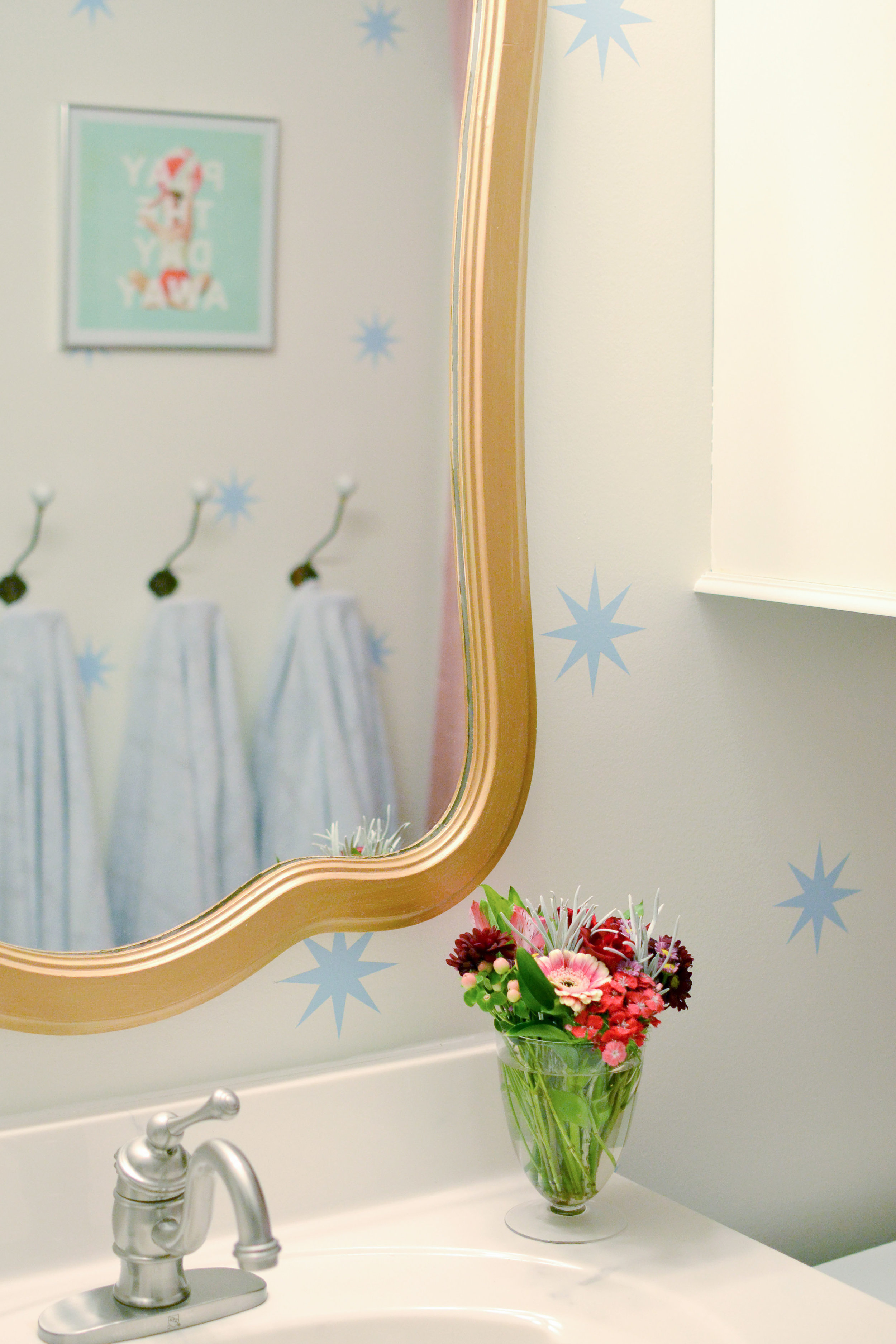
The kid's bathroom didn't change too much. A new mirror, wall hooks, updated paint, and wall decals refreshed the room and made it feel like a fun space. Small bathrooms are great places to add pattern to walls (decals or wallpaper) because the small area is better for your budget and is not as big of a risk as an entire, large room. So if you want to make a statement somewhere, but are a little nervous, start with a bathroom.
Before Bathroom
After
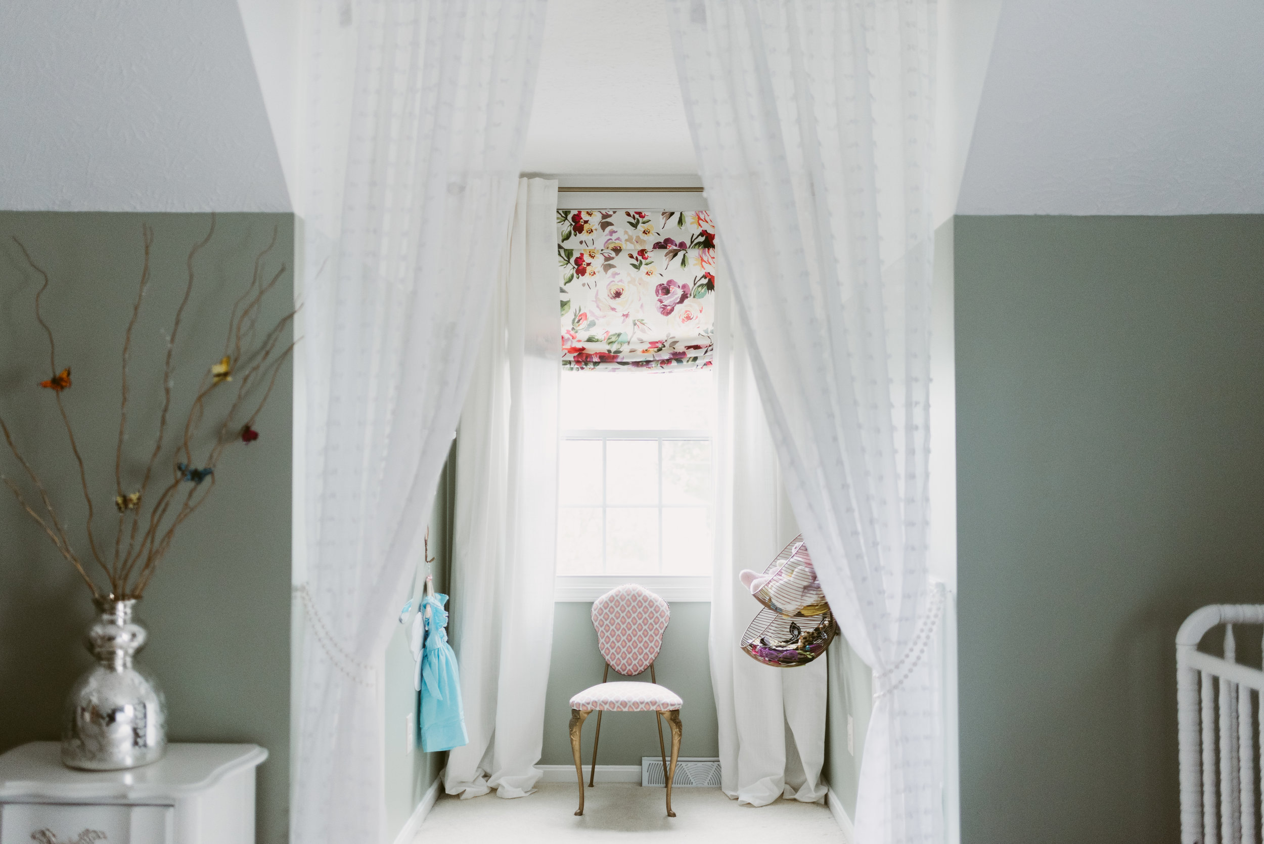
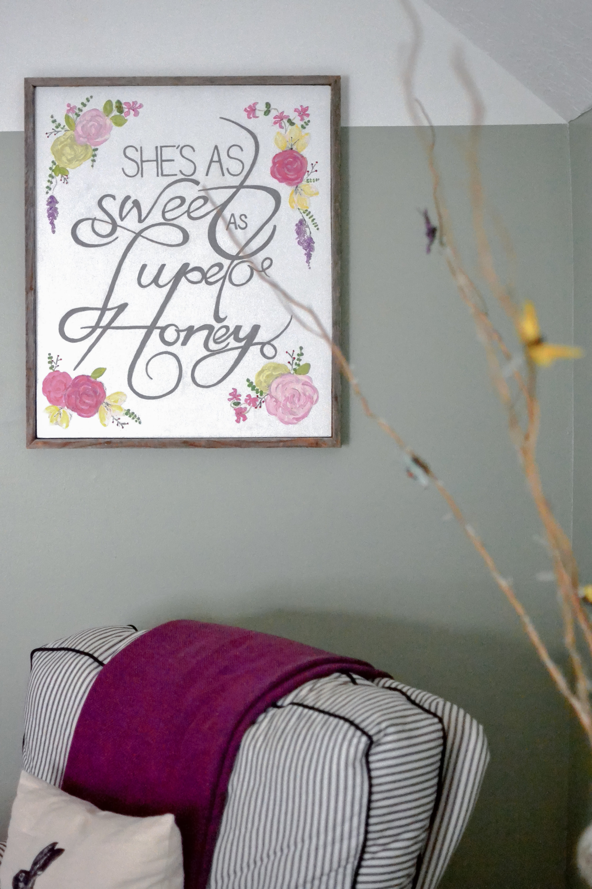
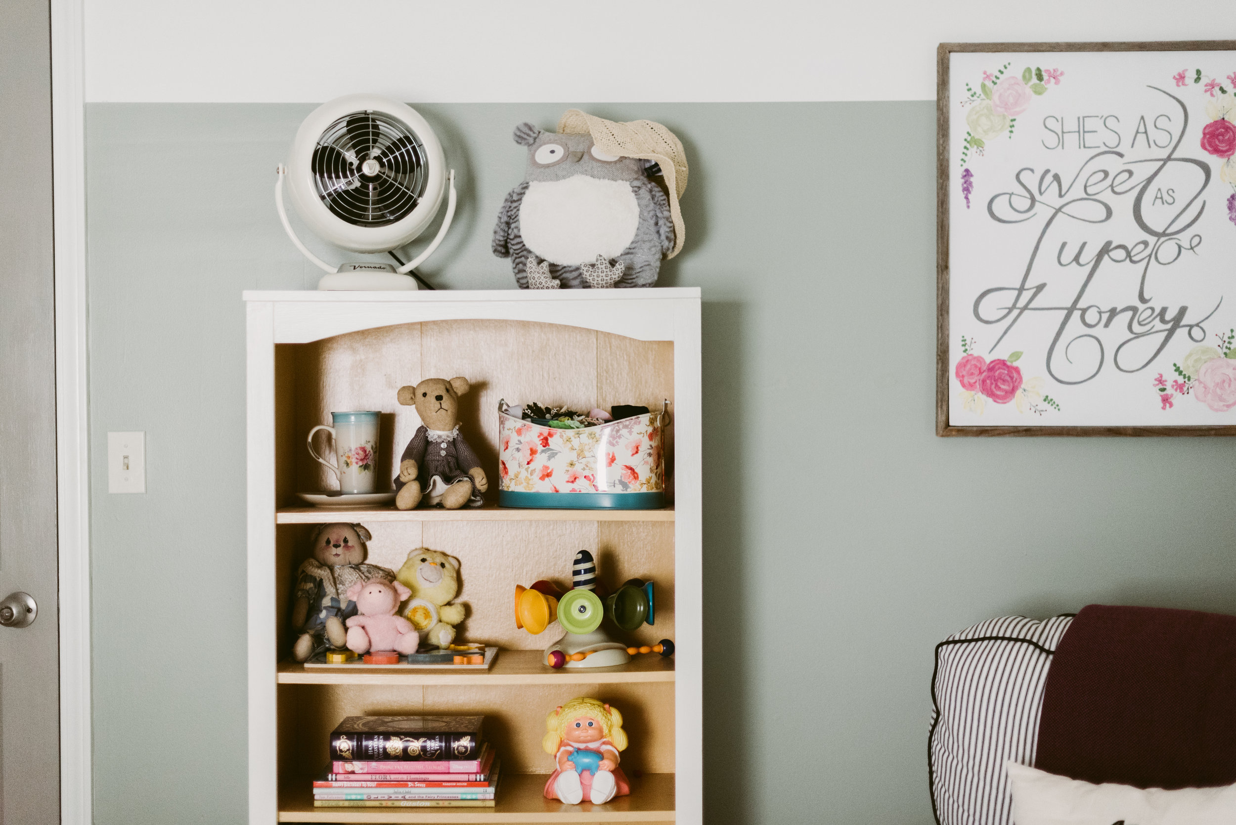
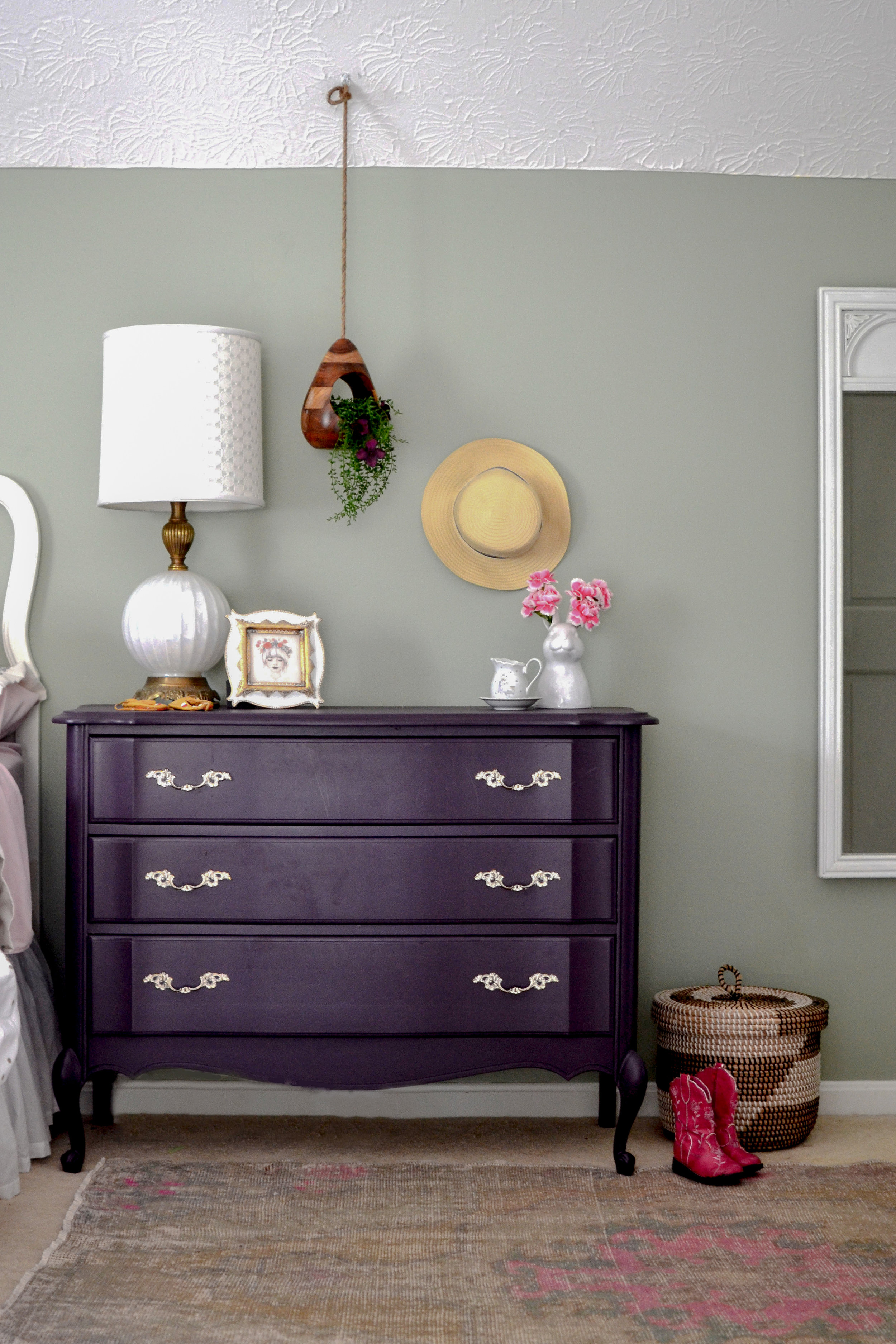
The little girl's nursery is a HUGE room, so arranging the furniture to fill the space but not letting it get too cluttered was a challenge. I used a rug and furniture groupings to create different "sections" in the room. I wanted to keep the walls gender neutral in case the kids share a room in a couple years, so I added the girly touches through textiles, furniture, and accessories. The furniture was re-used from 3 different spaces, but it was key to try and keep the lines similar.
Before Pic
The before picture shows just what a big difference paint can make. The color-blocking paint trend is also a great way to de-emphasize the diagonal ceiling/wall in an upstairs space. Make sure the "break" in color starts at the bottom of the diagonal and continues throughout the room.
Guest Bed
I separated the dormer area with a textured, sheer curtain to created a little play space and reduce the scale of the room.
Dormer Window
Both kid's rooms have attic access doors that originally were flat panels that had screws to close them. We updated the look of the doors and added hinges so they would open as doors. One of the attic spaces has wired lights and connects the rooms. We have started adding carpet squares and chalkboard walls to create a little playroom/hide-out area. I will share when it is finished.
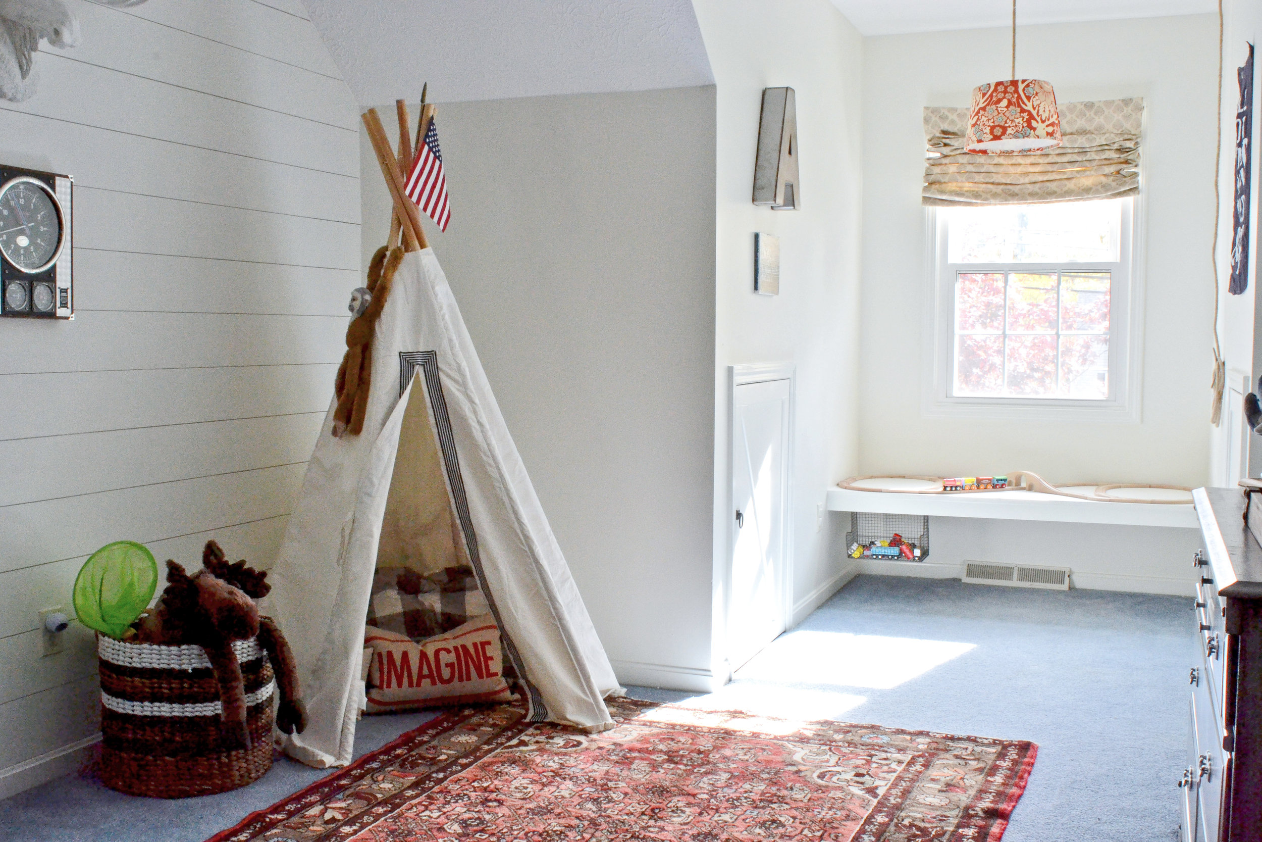
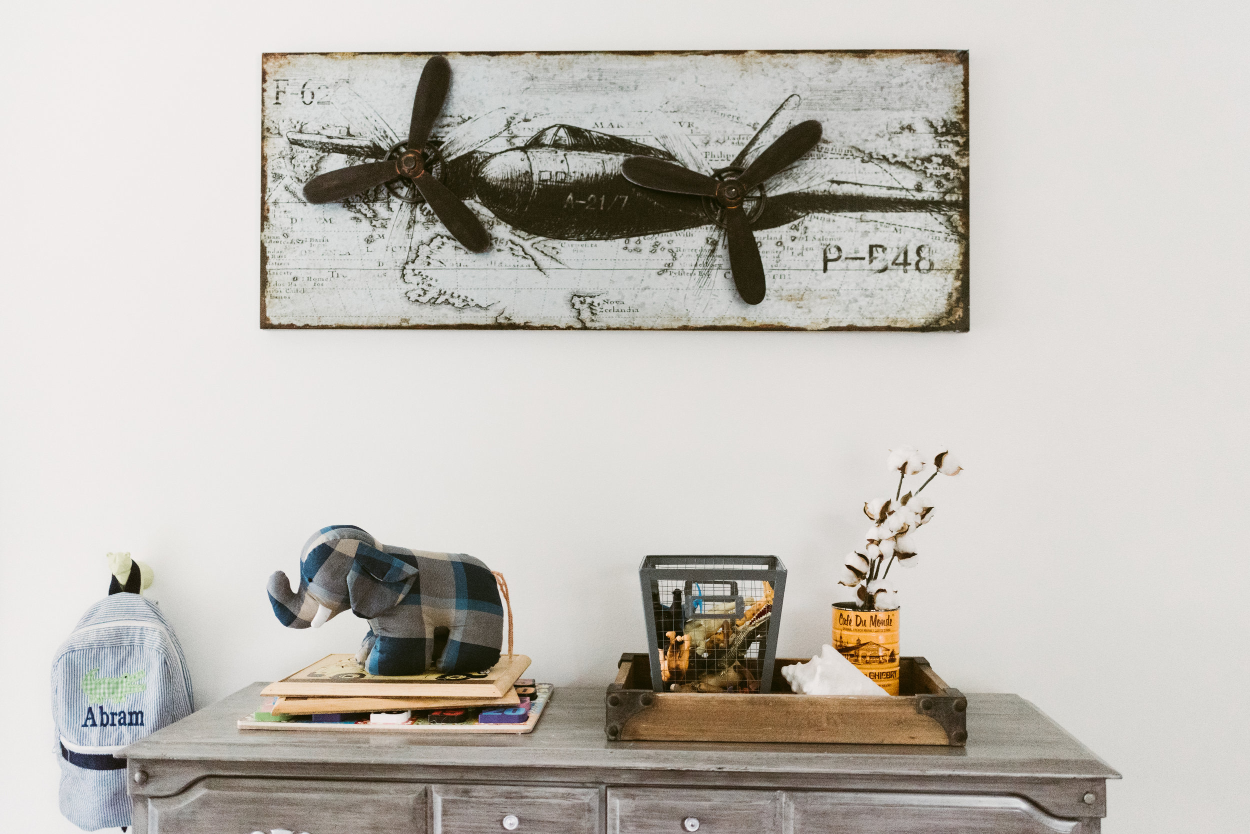
Next, the little boys room. This room had blue carpet that was in decent condition and wasn't in the budget to change out. The initial design stage focused on creating a room that would work with the blue, and make it look purposeful. While there isn't a "theme" in the room, since the house is a lake cottage, the "lake house" vibe is very fitting.
After
Before
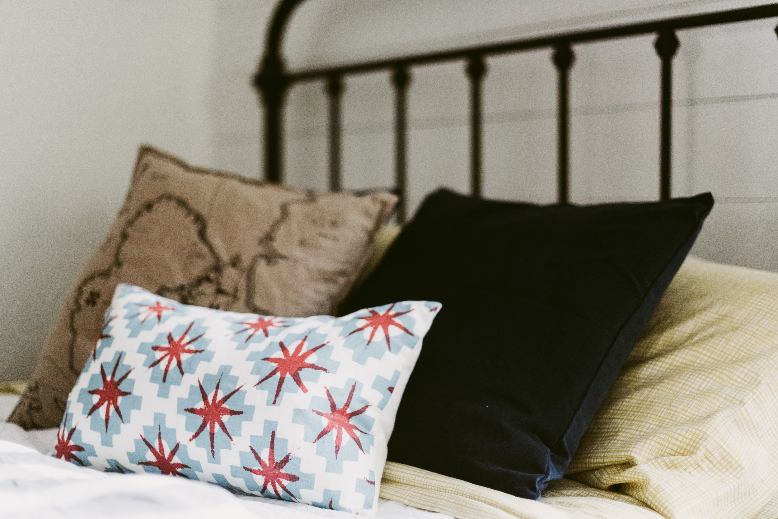
I had the walls painted white and installed shiplap to the back wall to add interest. There are red/orange and blue details throughout the room to give hints of "nautical". I also installed a floating window seat in the dormer. This seat can be used for reading when he gets older, but for now serves as the perfect train table.
Part 3 (the living room and master) are still in progress and will be posted whenever they are finished. I hope you've enjoyed this home tour. To get more design inspiration follow me on instagram and pinterest.
Thanks,
Nikki


