Spring Refresh | Outdoor Living
Four Fresh Outdoor Looks
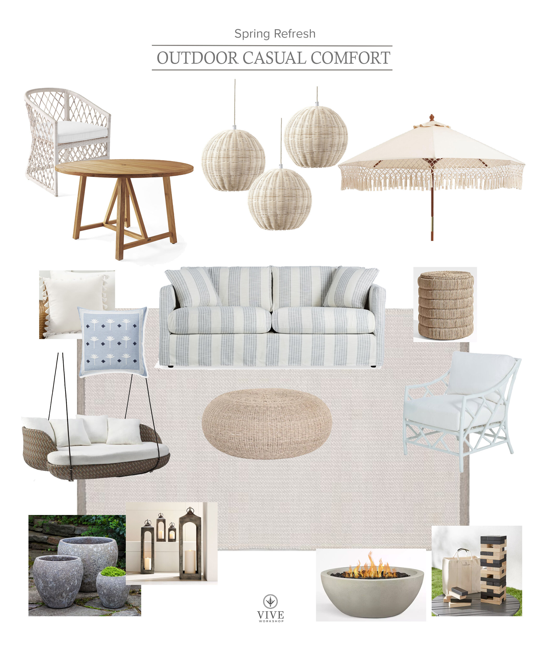
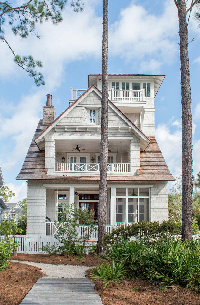
For our final day of the Spring Refresh series, we are moving outdoors. This is the best time of the year, in Texas, so I’m yearning to sit outside for every meal. Here are four of my favorite back porch looks to make outdoor living more enjoyable.
We hope you enjoyed the Spring Refresh series! If you would like to learn more about our design services, simply fill out the form on the contact page.
Enjoy your weekend!
Nikki
Spring Refresh | New Accessories For Your Refresh
Accessories For Your Spring Refresh
I have had a lot of requests for staging and styling lately. Unfortunately, I don’t take styling-only jobs so I figured a post about some of my favorite products and tips would be a great place to get you started!
My accessories change with the season and time, in general. I usually keep a few large scale, key pieces and move smaller items in and out. I usually work with a combination of items when styling shelves and tables. My basic styling “go-to’s” are books (which I will have to do another time), boxes, baskets, bowls, trays, art and/or framed pictures, vases, florals and greenery, candles, and decorative objects.
BOXES, BASKETS, AND TRAYS
I love to use these when I have an area that tends to have items being placed all the time. I like to “corral” anything I can and give it a purposeful place to rest. I also use boxes to add height by stacking then and typically placing an object on top.
FLORALS AND CANDLES
If you’ve followed me for any amount of time, you know I LOVE nature and anything that brings the outdoors, inside. If you don’t have a green thumb, there are plenty of realistic looking plants these days. There is no excuse to keep them out of your space; you need florals to soften the room. Candles are great for scent and ambience. I love finding large hurricanes and holders to really make a statement with my candles. I actually don’t burn them much these days, unless I need to set a mood with a particular smell, so I use the battery operated ones to set the mood. It never fails, I always get compliments on the ambience they give off anytime I turn them on for guests.
VASES AND BOWLS
Both of these could be used for a live floral display, but there are tons of beautiful options that can also stand alone. Some of the vases and bowls around my house are practically sculpture, and because they can come in a variety of sizes, shapes, and colors, they are perfect when you need to fill a specific void.
DECORATIVE OBJECTS
The final piece to the styling puzzle are the decorative objects. These will come in any shape, size, materials, color or look so the options are endless. I use these on top of books, boxes, trays, in voids, centered on a shelf, etc.
DESIGN TIPS
1——— When purchasing items to style, always buy more than you think you need. It takes a lot more to fill than you originally think. Check the return policy to verify you can return if not used.
2——— Lay out all of your items; I usually do this on a nearby table or floor. When you can see everything you have, it’s easier to visualize and grab-go/move when needed.
3——— Start with the back and bottom. What I mean is that if you are placing art on the back, for sure, place it (no worries if you need to shift for voids, just know you are using it). If you have a lot of books or books you love the look of for a table, place that stack or row first. If you have a tray for a coffee table, place that tray in position first. This will all create a foundation to layer upon.
4——— Use boxes and books, stacked, to add height to an area. Place an object on top to add interest.
5——— Mix metals and item materials. Don’t place too many like items together. Combine marble, woven baskets, matte black, and color together.
6——— Give your eye areas to rest. It doesn’t matter how good your items are, if you cram them together without a place for your eye to rest, you won’t see them. I like to layer items slightly over each other to create a line of sight, usually in uneven numbers, and then give myself some areas of nothing. If you’re styling shelves, I love to have a busier shelf adjacent to a shelf with one large item in the center. It helps to break up the “chaos”.
7——— Add items that make you happy, make you laugh, and tell your story. Family photos are always beautiful in black and white. I also have items I’ve collected from traveling that make me happy; they may not be the most beautiful item but they tell our story and are usually good conversation starters.
Tomorrow if the final day and we’re moving outside!
April 16- Outdoor Update
Enjoy,
Nikki
Spring Refresh | New Art For Your Refresh
Art For Your Spring Refresh
THIS POST WAS HARD!
Art is by far the hardest item for me to select for my clients. Not because of the lack of options or my love for it, but it is just so subjective! I either have clients that are huge art collectors or clients that don’t really have much or care about it. Regardless, art is needed to complete your space so if you’re about to start working with a designer, my advice would be to start looking and note what draws you in and resonates with you. At the end of the day, we generally choose the art that surrounds us because it brings about emotions (usually calm or happy), has a color that resonates with us or works with our decor, is a style we love (photography, object, painting, etc), helps to tell our story, can fill the void on our wall, and is the right price point for us.
So while this art may resonate with me, I understand if it is not your style. Hopefully this post can inspire some creativity and courage to revamp your collection. I’ll also try to give a few tips along the way!
FIGURES
You may have guessed. I have a thing for coastal feeling art. Anything that reminds me of the water instantly makes me happy! Teil Duncan and T.S. Harris are some of my favorite artists because of the color they use in their figure art. There is also some great line drawing figures that would be perfect for a neutral color scheme.
ABSTRACT
Abstract art is great when you need to add some drama and color. I love using abstract art as color in gallery walls or as a large scale piece that fills the whole wall.
LANDSCAPE
When you want a natural, relaxed feel a landscape is perfect! I added the longhorns because…when in Texas!
BOTANICAL
Perfect for girly and natural spaces. There are also beautiful, large scale floral tapestries that can add an impact and give the room a vintage feel.
OBJECTS
There are times that a sculptural object would make more of an impact. I have also had clients that don’t love "flat'“ artwork, so in these cases I like to use hanging pieces, framed textural cloths and paper, and sculptural objects like baskets and metal figurines. They are great for adding texture without adding too much color.
DESIGN TIPS
1——— Know the budget and size you need. If you can’t find a large enough piece to fill the space or budget, try combining multiple pieces as a triptych, diptych, stacked art, or gallery wall. Smaller pieces are typically less expensive and can create a more custom size when needed. Use painters tape to mark the size on the wall and make sure it will work.
2——— Don’t let the frame stop you from purchasing if you love the art. The frame can always be changed. Keep the glass and find a frame without it or get one custom made to fit perfectly. I have a piece that we bought in the Cayman Islands. We loved it and it reminds us of our trip, but the frame is AWFUL, so I am planning on a switch before hanging it in our new home.
3——— To make lower priced art look more high end or larger, get it matted. Matting can be used over the art or the art can be floated above the art.
4——— If nothing is striking you, consider paying for a custom piece. I have had clients and friends get custom pen drawings of their children or paintings of this family on the beach. This will instantly make it more meaningful and will look better than a room of family photos.
5——— If you lack wall space for art, utilize floor and tabletop easels to display your favorites.
Here what’s in store for the rest of the week!
April 15- Our Favorite Accessories
April 16- Outdoor Update
Enjoy,
Nikki
Spring Refresh | Favorite Wallpaper
Our Favorite Wallpaper
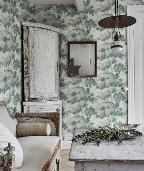
Wallpaper is back in a big way. Selecting my favorite wallpaper is like selecting my favorite child; they are each so unique and special. I often let the wallpaper set the tone of the room, and each one can create a different feel. There are so many great patterns, colors, and textures at a variety of price points. However, let me go through a few that I have been really into lately.
COLORFUL PATTERN
Having some fun with colorful wallpaper is a great way to rejuvenate a space. If you’re nervous to use something like this, but really want to try, I suggest starting in small rooms like laundry and powder rooms. Not only can the small rooms pack a punch, but it’s less of splurge because there are less square feet. I usually select my paper first, then coordinate other colors and fabrics with a color found in the pattern.
NEUTRAL PATTERN
For pattern without the color, there are a ton of options. I love the metallic finishes through lines like Schumacher, or a good floral motif. Stripes are always going to feel classic; there are both small and large scale depending on how bold you want to go.
TEXTURED
When you want to add depth and substance to a wall without adding pattern, a textured paper is great! They come in many colors, and even some patterns. I love grasscloth and sisal papers on ceilings, in dining rooms, living rooms, and bedrooms. There are even faux “wipeable” grasscloth papers from companies, like Thibaut, that can be used without worry in bathrooms and kid’s spaces.
Here is the rest of the line-up:
April 14- Our Favorite Art
April 15- Our Favorite Accessories
April 16- Outdoor Update
Enjoy,
Nikki
Spring Refresh | Green Paint Colors
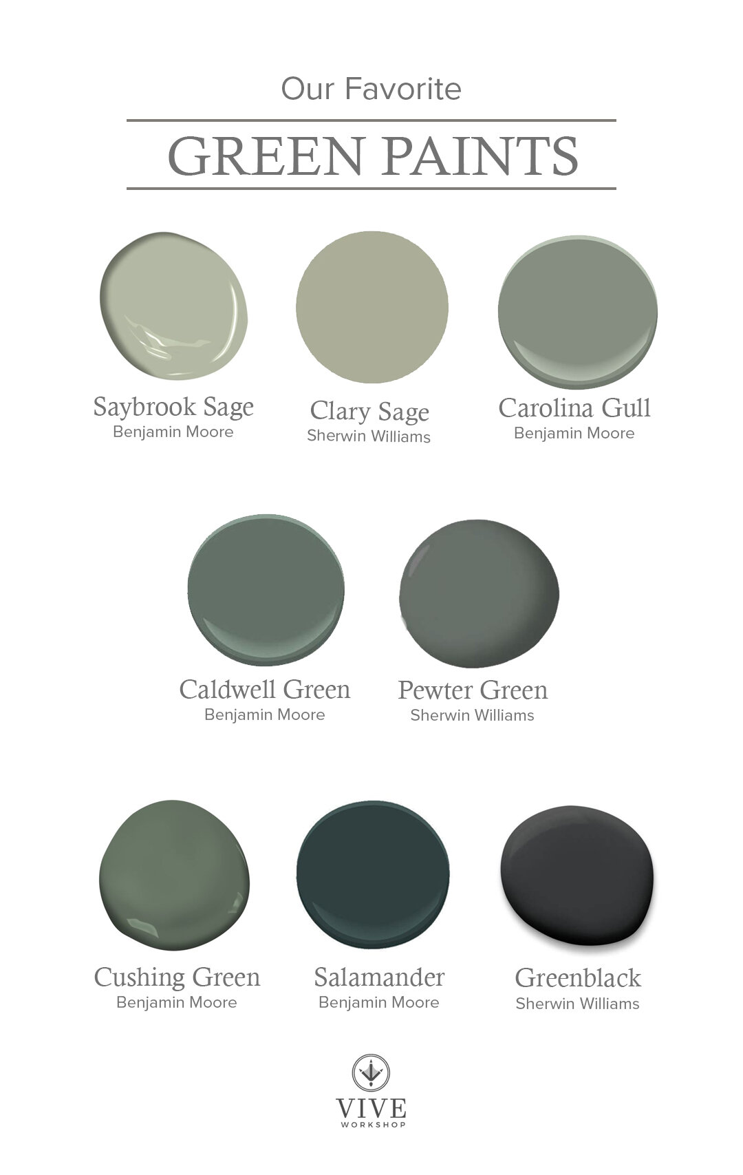
Our favorite green paint colors.
I love a green paint to bring “nature inside” the home. It can feel fun and playful, relaxing, boho, or sophisticated.
SAYBROOK SAGE by Benjamin Moore
A soft sage green that will always be a timeless classic. There is a gray undertone that dulls out the green, but also has some warmth to it. This color pairs well with fresh whites, grays, yellows, and even pinks in a girl’s room. Here it is paired with Chantilly Lace.
CLARY SAGE by Sherwin Williams
This is another sage green that has undertones of gray and warmth. This color looks great on cabinets with fresh white countertops and backsplash.
Image via Blesser House
CAROLINA GULL by Benjamin Moore
This muted mid-tone green that is a soft backdrop to any room. This color has an undertone of gray and could also be considered a sage.
Image via Pennies for a Fortune
CALDWELL GREEN by Benjamin Moore
This mid to dark green had undertones of gray and blue. The green has an olive hue and would look great against whites, blacks, and wood tones.
Image via Studio Mcgee
PEWTER GREEN by Sherwin Williams
Another cool sage-y green…apparently I’m drawn to them. This deep green has a bit of blue in it that brings out a rich teal vibe, giving you a sense of pine trees. This color pairs with whites, neutrals, golds, blacks, and warm woods.
Image via House Beautiful
CUSHING GREEN by Benjamin Moore
A rich warm green that can add a punch to any room. I love this color when mixed with brass, white and black.
Image via Design Chic
SALAMANDER by Benjamin Moore
If you want a green with drama, this may be the color for you! This deep green has a hint of blue which makes it feel like a hunter green. It’s another one that looks great with whites, blacks, and cognacs.
Image via Apartment Therapy
GREENBLACK by Sherwin Williams
When you are feeling bold, but don’t want a true black this is a great alternative. It has a slight green undertone which makes it feels a little more natural and warm. It feels sophisticated and and moody, and is a great contrast against white.
Image via Studio Mcgee
Tomorrow, we have a little fun with our favorite wallpaper!
April 13- Our Favorite Wallpaper
April 14- Our Favorite Art
April 15- Our Favorite Accessories
April 16- Outdoor Update
Enjoy,
Nikki
Spring Refresh | Favorite Rugs
Our Favorite Rugs
I often have clients ask what I start with when a designing a space. Though it depends on the situation, I prefer to either start with the rug or piece of art. A rug can set the tone for a room and it’s much easier to pick a paint color that ties into one of the rug colors than to find a rug that can tie into a chosen color. I could go on and on about my favorite rugs… Did you know my father-in-law grew up selling rugs, in Iran, and opened his own store in the US that my husband worked at in high school? Anyway, for the purpose of this blog, I’m breaking down some of my favorites into categories.
COLORFUL
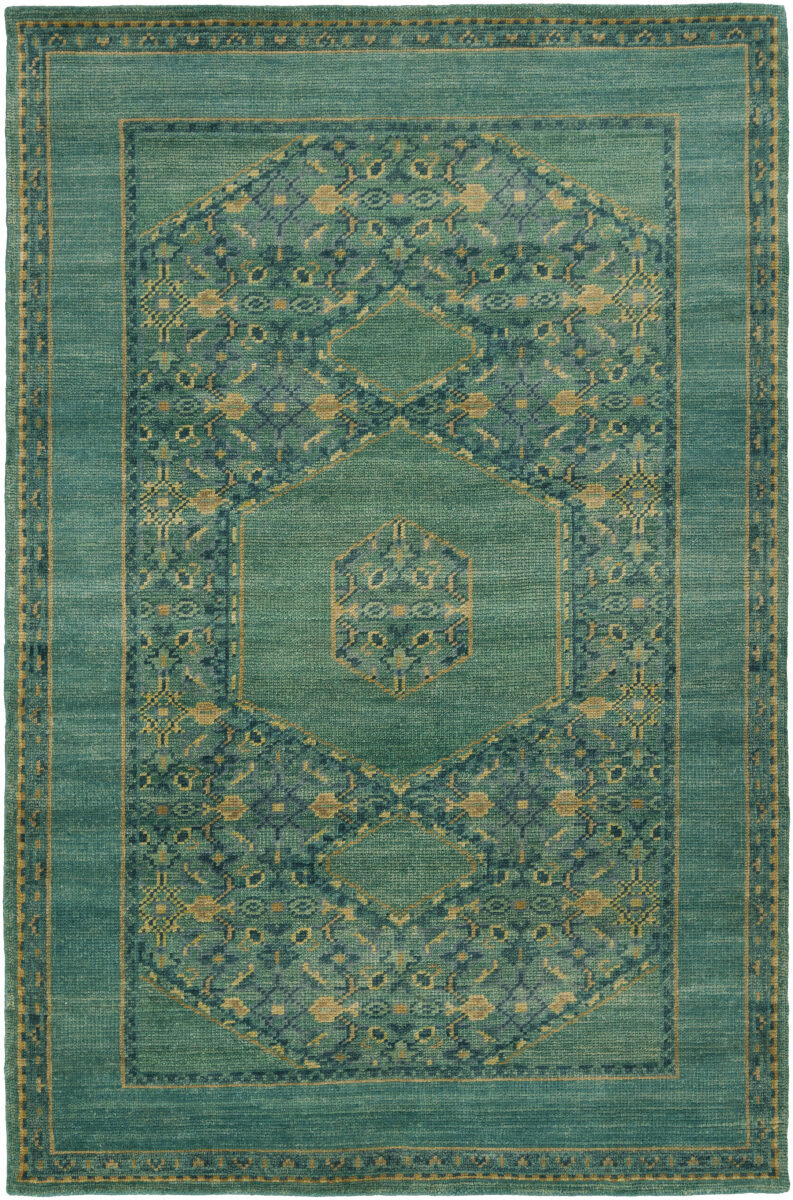
I love a good spin on traditional rugs. The new styles of rugs with traditional patterns and more contemporary color are some of my favorite ways to add color to a space. There are a wide range of colors and patterns of these. I would recommend 100% wool when possible; it is the easiest to clean with a family. There are synthetic rugs for the lower budgets, but I would advise against anything with Viscose. It looks so beautiful and “silky” when new, but quickly gets damaged by water and dulls.
STRIPED
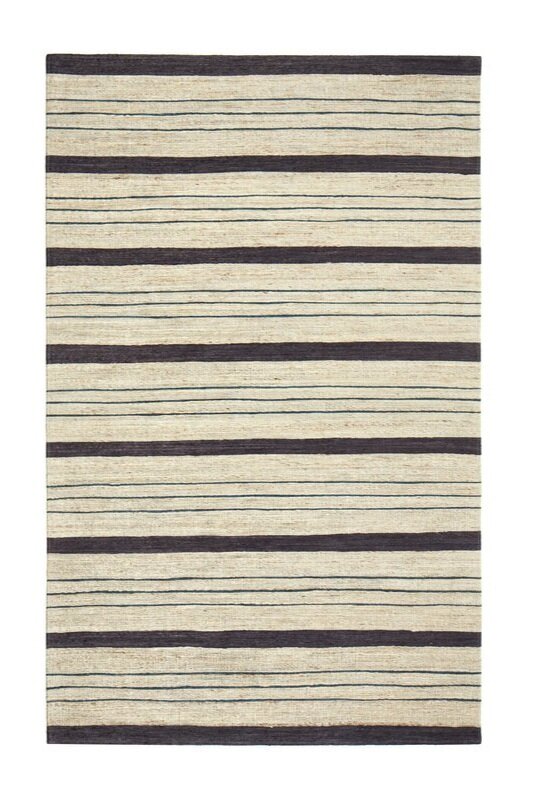
A good stripe is always in style. I use these when clients are scared of a lot of pattern, but want a little. They are also great for coastal styles and outdoor rugs, in certain materials.
NEUTRAL PATTERNED
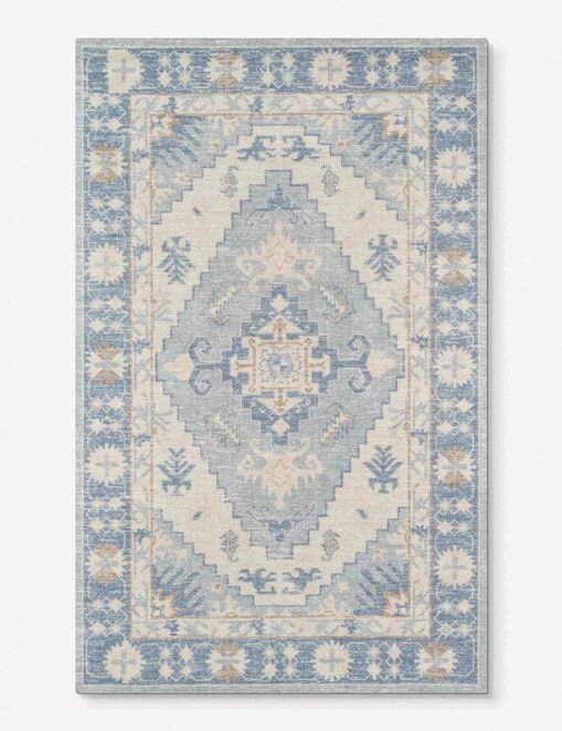
Neutral rugs are perfect for spaces that don’t need a color but do need some pattern. These can come in both, traditional and contemporary patterns. Again, I would recommend 100% wool rugs.
NATURAL TEXTURE
For designs that don’t call for color or pattern, I always add texture to create interest. These rugs can also be layered together or with any of the other rugs to fill a space. Most of the textured rugs come in Jute or Sisal. Some of these can be hard on the knees if you have babies, so seeing them in person may be important. Hide rugs add an organic shape to a room. If you aren’t a fan of real hide, there are some great synthetic options available.
Have a great weekend! Here is the rest of the line-up:
April 12- Green Paint Colors
April 13- Our Favorite Wallpaper
April 14- Our Favorite Art
April 15- Our Favorite Accessories
April 16- Outdoor Update
Enjoy,
Nikki
Spring Refresh | Blue Paint Colors
Our favorite blue paint colors.
Blue has almost become a neutral in many households, nowadays. Navy islands paired with white cabinets are timeless and grays with blue tones have become the “blue” for clients who don’t want to commit to saturated colors. Today, we are covering some of our favorites, though it was tough to choose!
SEA SALT by Sherwin Williams
This light blue-green is very coastal inspired which is telling by the name, alone. It feels fresh and airy. This is definitely a color chameleon that can either be gray, blue or green depending on the light so make sure to test it in your space.
Image via Homebunch
WOODLAWN BLUE by Benjamin Moore
This versatile light blue is serene and tranquil. While I refer to it as a blue, it does have a green undertone and can be a chameleon depending on the amount of natural light that it receives. In more natural light, the blue becomes more vibrant, while with less it appears more gray.
Image via Old Seagrove Homes
STARDEW by Sherwin Williams
This muted light to mid blue is a great “neutral” that would look good on cabinets and walls. It has a lot of gray to it which makes it a cooler tone that can pair well with warm accents.
Image via Sherwin Williams
BOOTHBAY GRAY by Benjamin Moore
This is another gray-blue color that I have used when clients don’t want a saturated blue but want a color that feels blue. This one is a little more mid-tone, and works great on cabinets, doors, and walls.
Image via Nesting With Grace
POLARIS BLUE by Benjamin Moore
This mid-range blue is absolutely beautiful on cabinets! It has a slight gray undertone that helps to cut the saturation a little. It feels both fun and classic at the same time.
(CABINETS) Image via Studio McGee
GENTLEMAN’S GRAY by Benjamin Moore
A deep, rich blue that could be considered a navy. It is pretty saturated and does have a teal appearance in some lights.
Image via Gathered Living
HALE NAVY by Benjamin Moore
This is probably the most used blue over the past few years. It is a very dark and sophisticated navy with undertones of warmth and gray. For those who want a deep navy with drama but not too competitive with other colors, this one is a no-fail color. I have used this on islands, dining rooms, pantry cabinets and walls…everywhere!
Image via Remodelaholic
NAVAL by Sherwin Williams
This deep navy is a versatile blue with warm tones to give it balance. Sherwin Williams describes it’s references as being the sea and the night sky. Maybe that’s why this saturated blue still feels very natural. It looks amazing for dramatic walls or cabinets.
Image via Architectural Digest
Tomorrow, we kick off our shoes and talk rugs to celebrate Friday!
April 9- Our Favorite Rugs
April 12- Green Paint Colors
April 13- Our Favorite Wallpaper
April 14- Our Favorite Art
April 15- Our Favorite Accessories
April 16- Outdoor Update
Enjoy,
Nikki
Spring Refresh | Toy Organization
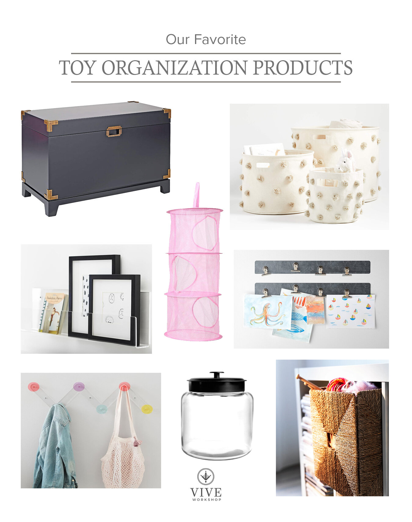
Our favorite Toy Organization Products
One of the biggest challenges in being a parent of young children is trying to find a way to keep the toys off the floor. I once read that the goal in picking up toys is a “five minute cleanup”. Basically, if you can get your children to clean up everything within five minutes, then it’s more likely to get done every day. Having baskets, jars, hooks, and chests that can contain categorized items will help the kids know exactly where everything belongs.
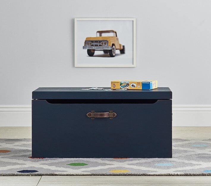
TOY CHESTS
Toy chests are great for large toys that need to stay hidden. My sons large trucks and planes are often hidden in our chest. I have also found that ALL the dress up stuff can be hidden inside them. I used to try and hang everything, but the kids couldn’t do it and with the tiaras, mask, hats, etc there were a lot of pieces, so the trunk become a much quicker way of containing everything. They love to dig through to find their favorite costume, then just throw it all back in for a quick cleanup.
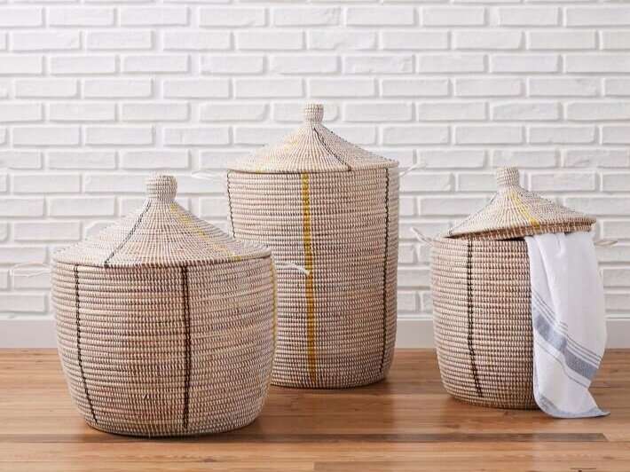
FLOOR BASKETS
Baskets add texture and a decorative touch to a space, and are great for all the random toys. My kids have them for stuffed animals and a lidded basket for dirty laundry. There is a great variety so you can coordinate with the look of the room.
BOOK SHELF DISPLAYS
I will do anything to get my kids interested in books. I also like to have a little fun in their spaces. These book shelf displays attached to the wall and can be used for books or art. I love to coordinate this shelf by the season; all of our favorite fall books in the fall, etc. It keeps the books we are reading fresh and exciting. Plus, the illustrations on the children’s books are so good they double as art!
HIDDEN HANGING BASKETS
No matter how much storage I create, there is always a need for extra hidden storage. These hanging baskets attach to the closet rod and hang in the corner of the closet. We keep the small animals, legos, blocks, etc in them. The kids love that they can reach most of it.
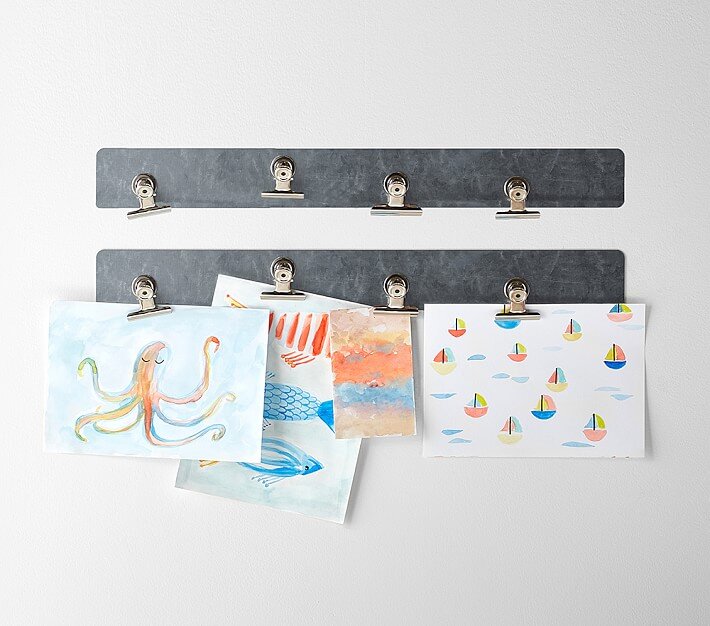
ARTWORK DISPLAYS
Once your kids start childcare, the amount of artwork that comes home every week can be daunting. Where do you put it all!? I do a mix of everything…I sneak some of it in the trash, some in long-term storage for future memories, and the stuff I love or that they are really proud of gets put on display. Their eyes light up when something gets hung on the wall. Creating an area of wall for art display makes a colorful impact and a place where they can proudly show friends and family their creations. I either do that with frames or clips. These clips can be hung wherever there is space.
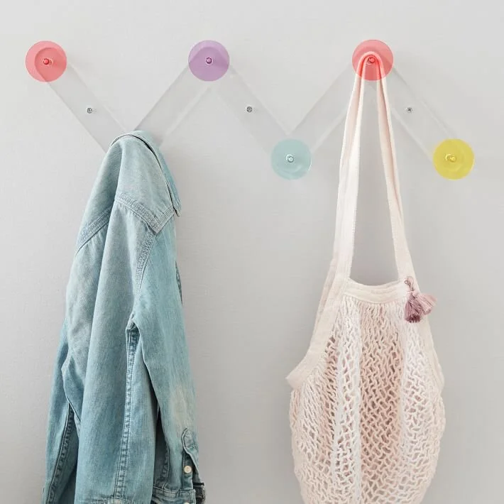
WALL HOOKS
Another type of wall storage are wall hooks. These are perfect for jackets and backpacks. They can also work for their favorite dress up clothes and purses. I’ve even used them to decorate children’s rooms with a cape hainging from it or decorative hanger with a keepsake baby dress.
JARS WITH LIDS
Crafting can quickly become dis-functional without a way to organize everything. I love the glass jars for children that are a little more responsible with glass. They can be displayed on the craft table or on a shelf with crayons, markers, pom poms, scissors, bubbles, you name it. They also come in a range of sizes.
SHELF UNITS WITH BASKETS
Every playroom needs some sort of shelf with areas for books, toys, and baskets for collections. The Kallax shelf, from Ikea, never gets old. Pair it with Knipsa baskets on the bottom row for a textured hiding spot. There are also great units from others stores, just look for a mix of shelving and basket or drawer hidden storage.
Here is the rest of the line-up:
April 8- Blue Paint Colors
April 9- Our Favorite Rugs
April 12- Green Paint Colors
April 13- Our Favorite Wallpaper
April 14- Our Favorite Art
April 15- Our Favorite Accessories
April 16- Outdoor Update
Enjoy,
Nikki
Spring Refresh | Gray and Putty Paint Colors
Our favorite gray and putty paint colors.
Today, let’s tackle gray and putty paint colors. I originally had an entire post for each of these, but let’s be honest, there are enough gray color guides to go around. Along with that, every client that I consult knows what gray all of her friends have. Safe to say everyone is pretty well-versed in gray colors, but they are moving into warmer tones….sometimes called greige, putty or mushroom. I’ll try to cover the newer options along with a few of my favorite, classics.
CLASSIC GRAY by Benjamin Moore
This is a timeless gray, in my opinion. It has a good amount of warmth to it so it can almost appear beige in some lights. It is a very light gray so I have even had clients question if it was white. With popularity moving towards white paints, it would be a middle-ground.
Image via Homebunch
HALO by Benjamin Moore
Another pale gray that can almost look white, this color has some warmth and sometimes a tint of green to it. It can have a historical feel. I used this all over my last house and it would change color depending on the colors around it. Based on the season just outside the windows, it would look warmer, true gray, or green/gray. It made it a really versatile color.
Image via South Meets Lake Project
REPOSE GRAY by Sherwin Williams
A great mid-tone gray that has warmer undertones. This gray is another versatile one that can look different based on the colors around it. If you’re nervous about beige or going too light, this is a safe gray to go with.
Image via Jenna Kate At Home
CHELSEA GRAY by Benjamin Moore
A deeper warm gray with a slight green undertone. This is another versatile gray that can be used when you’re wanting something a little more rich. This gray would pair well with white trim and cabinets to create a high contrast look without going black.
Image via Laurel Bern Interiors
DOVETAIL by Sherwin Williams
Another rich, warm medium gray. This gray borders on charcoal to give a moody, masculine look that makes white trim pop.
(CABINETS) Image via Homebunch
KENDALL CHARCOAL by Benjamin Moore
A dark gray with some green undertones, this gray gives a rich depth to any room it is painted with. This color would work well in modern and traditional spaces.
Image via Homebunch
SEAPEARL by Benjamin Moore
This color can either be considered a light greige/mushroom or warm, off-white. If you’re wanting a white that isn’t stark white, or a slight gray tone without it looking like the grays of the 2000’s, this may be the color for you. It has a creaminess that isn’t too creamy, just a bit of softness. This color looks great with blacks, bronzes, dark woods, and whites.
Image via Remodelista
PALE OAK by Benjamin Moore
A warm, neutral almost white that gives the space a soft glow. The warm undertone in this color can sometimes give the color a pink shade in certain lights, so test out before using. In low lighting this can look more greige, whereas, in more natural light this looks like a warm white. This color looks great against blacks, bronzes, and dark woods.
Image via Remodelaholic
BALBOA MIST by Benjamin Moore
A soft warm gray that can coordinate with almost any room. This grey may be the definition of the term “greige”, though it does have some green and pink undertones. This is another one that can turn colors depending on the lighting, so test out before committing to the whole room.
Image via Hideaway
PASHMINA by Benjamin Moore
A putty “greige” that is slightly warmer than popular grays like Revere Pewter. This color is a great rich, neutral to use when you’re wanting to start moving away from gray. There are some slight green undertones that can arise in certain lighting. If you’re wanting warm mushroom cabinets, this color would be perfect!
Image via Censational Style
Image via Claire Jefford
ADAPTIVE SHADE by Sherwin Williams
A deeper putty color that still has a slight gray undertone. This color is rich and would look great on walls and cabinets against white trim and countertops. This color has also been a great choice for traditional exteriors.
Image via At Home With The Barkers
Tomorrow, we are diving into our kid’s spaces and finding better options for toy storage.
April 7- Toy Organization
April 8- Blue Paint Colors
April 9- Our Favorite Rugs
April 12- Green Paint Colors
April 13- Our Favorite Wallpaper
April 14- Our Favorite Art
April 15- Our Favorite Accessories
April 16- Outdoor Update
Enjoy,
Nikki
Spring Refresh | Closet Organization
Our favorite Closet Organization Products
The changing of seasons always leads to a big closet refresh; all the warm weather clothes come down and all the sweaters and coats move up. There is always much more joy in the morning routine when I can see all the pieces of my outfits, clearly, and plan something that fits my personality.
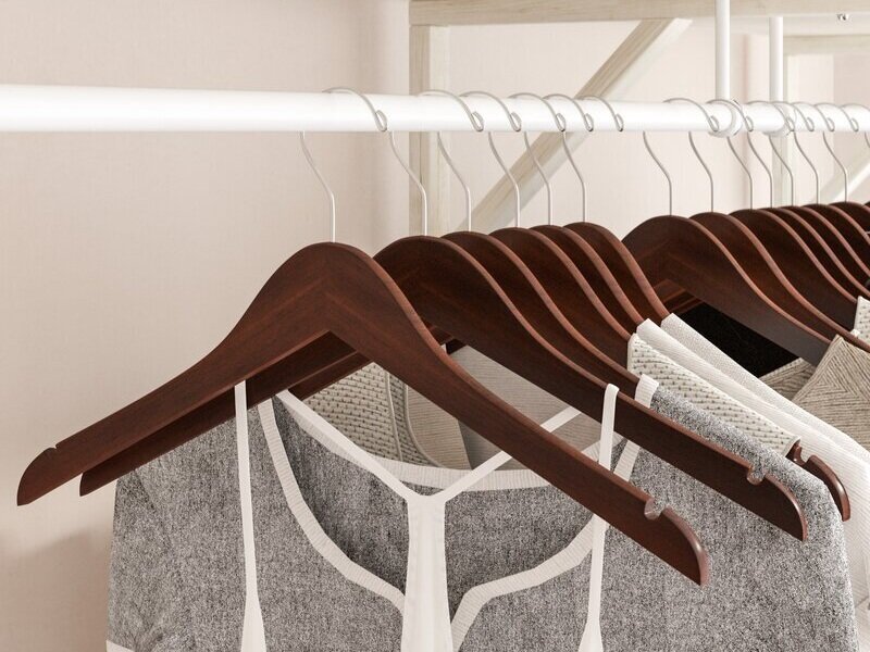
WOODEN HANGERS
The day I changed my closet to all matching hangers, I instantly felt more like an adult. Ridiculous, I know, but that is the power of a put together and organized closet. If even one piece of me can feel more “together” I will take it.
VALET ROD
My best days begin the night before. I love to have my outfit pre-selected on a busy morning. Using a small valet rod to hang my outfit keeps it separated, easy to steam, and easy to grab and go.
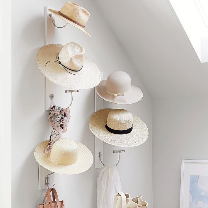
HAT HOOKS
If there is a free wall in the closet, hooks for necklaces and hats are great for keeping everything separated and out of a pile. These vertical hat hooks are great for a narrow wall.
SHOE BOXES
Keeping shoes in boxes helps me keep them more organized and reduces damage. I used to keep them in their original boxes, but many would have torn boxes or didn’t come in a box at all. Seeing the shoes inside makes it a much quicker process to select the shoe for the day. Having a box that has a flip down end or drawers also means there is no stacking and potential shoe avalanches in the middle of the closet.
CLEAR FRONT DRAWERS
This cannot be done in every closet, but if you can add some customization, even just from Ikea drawers it instantly makes for a more orderly and “high-end” closet. Ikea makes a few different closet drawer options. I love these clear front drawers for seeing the items inside.
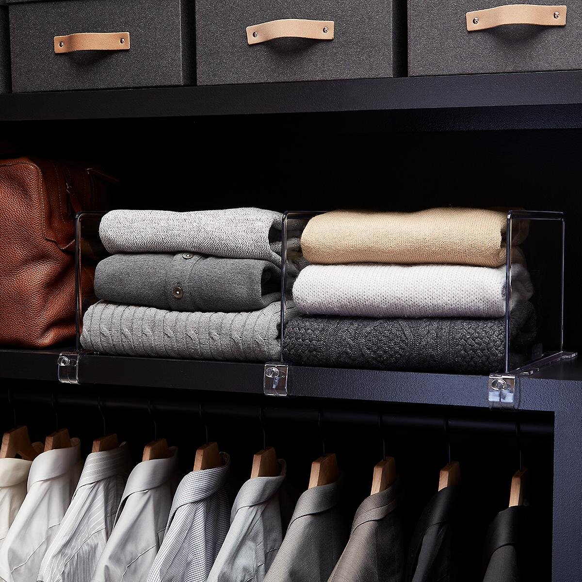
SHELF DIVIDERS
If you are someone who prefers folding clothing over hangers, shelf dividers can be a life-saver! These clear dividers make sure the piles stay in place, while not blocking your view.
FABRIC BASKETS
Fabric baskets work well with clothing and like-items because they won’t snag anything. These baskets keep their shape pretty well, look nice, and can be used to contain items that are many pieces or aren’t accessed very often (like scarves, mittens, etc.).
DRAWER TRAYS
If you’ve been reading these spring refresh posts, you know by now how much I love a compartmentalized drawer. These bamboo trays are a rich tone and would be great for jewelry, watches, sunglasses, and ties.
Here is the rest of the line-up:
April 6- Gray and Putty Paint Colors
April 7- Toy Organization
April 8- Blue Paint Colors
April 9- Our Favorite Rugs
April 12- Green Paint Colors
April 13- Our Favorite Wallpaper
April 14- Our Favorite Art
April 15- Our Favorite Accessories
April 16- Outdoor Update
Enjoy,
Nikki
Spring Refresh | Black Paints
Our favorite black paint colors.
Today, I’m covering black paints; they pair so well together for a sharp contrast. People are painting their windows, doors, or even cabinets black. I also love the drama it can create when a whole room is painted black!
WROUGHT IRON by Benjamin Moore
I love this charcoal, almost black, color! I used it on the back wall of this dining room for some added drama, but keeping it away from stark black made it tie in with some of the more historical looking elements. There is a slight undertone of brown which adds to the versatility of this color; making it pair well with warm tones.
Image via South Meets Lake Project
IRON ORE by Sherwin Williams
Another rich charcoal, and a color that is very comparable to Wrought Iron. These colors can also be considered a soft black which is why they are included in this round-up. I use these colors for drama and accents. Ive used this on cabinets, doors, and stair rails against white and it always looks clean and beautiful.
Image via NeatlyLiving
SOOT by Benjamin Moore
Another dark charcoal with warm undertones. This color is a little deeper than the previous two.
Image via Homebunch
BLACK BEAUTY by Benjamin Moore
Black Beauty, 2128- 10 is a bold color choice and you’ll notice the color is very similar to Onyx. The LRV of Black Beauty is 3.26, so it’s less of a true black when compared to Onyx.
Image via Homebunch
CAVIAR by Sherwin Williams
This is a deep black that has a small amount of brown tint which warms it up.
Image via Homebunch
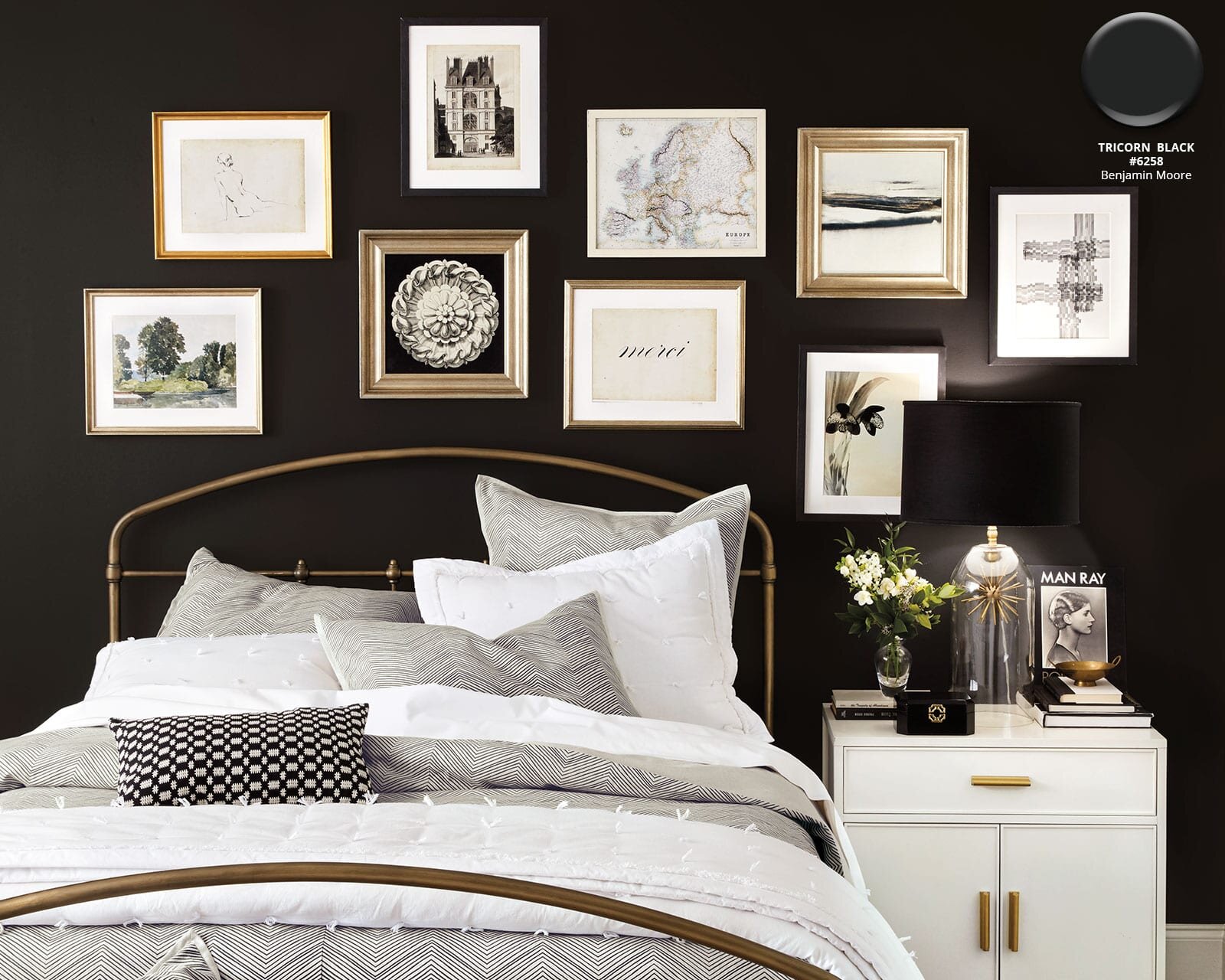
TRICORN BLACK by Sherwin Williams
This is a very popular black! It is very deep and doesn’t have a lot of undertones so I often recommend it to clients that want a true black. It looks great on a kitchen island with white cabinet surrrounds.
Image via Ballard Design
BLACK MAGIC by Sherwin Williams
This is another deep black that is similar to Tricorn Black and Caviar. It has a warm undertone which makes it very comparable to Caviar. If you want black doors, this would be a great black to use.
Image via Homebunch
Enjoy your Easter Weekend! I’ll be back on Monday to share my favorite closet organization products.
April 5- Closet Organization
April 6- Gray and Putty Paint Colors
April 7- Toy Organization
April 8- Blue Paint Colors
April 9- Our Favorite Rugs
April 12- Green Paint Colors
April 13- Our Favorite Wallpaper
April 14- Our Favorite Art
April 15- Our Favorite Accessories
April 16- Outdoor Update
Enjoy,
Nikki
Spring Refresh | Office Organization
Our favorite Office Organization Products
Last year changed the way we work; most of us shifted to working from home with many staying that way, permanently. Staying organized and on task is the key to a successful day when working from home.
CALENDAR
Life can come at you from every angle, sometimes, which makes for a hectic schedule. Having a calendar to quickly glance at can keep the whole family on the same page. I love this clear, streamlined calendar. I also love that it’s erasable to keep everything neat and tidy.
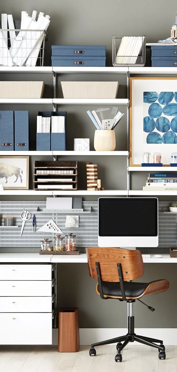
SHELF FILE BOXES
Though I have a file cabinet tucked into a closet, there are times when I need to store projects, paperwork, and resources that I need to access regularly but keep hidden from sight, for the most part. I love these horizontal boxes and magazine files. They allow me to categorize the items I’m storing and pull them out on a moment’s notice. I also don’t have to worry about how “pretty” everything is. They come in a range of colors depending on the scheme of your office. I typically like to mix the horizontal and vertical files, often stacking the horizontal boxes and placing a decorative object on top.
Image via The Container Store
DRAWER ORGANIZATION
Nothing is more frustrating than digging through drawers for the item you need. Shallow containers to keep everything separated and organized can be a life-saver! I love that these come in a couple fun colors to add a little fun, even if it’s just when you open your drawer.
PENCIL HOLDER
Even if you keep everything in the drawers, keeping a few pens or pencils on your desk for visitors to use is a form of courtesy. I love that these container can be separated or grouped together on the tray. I also love their neutral feel reminiscent of classic pottery.
COLLATOR
Piles of paperwork can quickly become dysfunctional. Don’t tell him I told you this, but my husband is a “piler” and there have been times it takes him days to find important paperwork because of it. Using a collator on your desk is a simple way to keep all income or “in-use” mail, papers, and files organized and easily accessible. Depending on how much paperwork comes through your desk, I would advise setting a day once or twice a week to file everything in your permanent files to clear the way for the coming days.
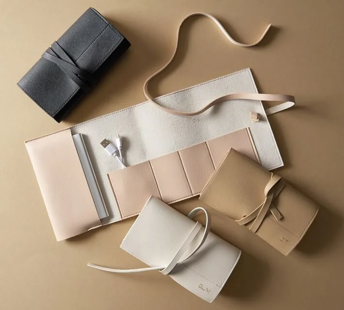
CORD STORAGE
I gave a travel cord case as a Christmas gift a couple years ago and realized just how handy they can be. I usually have my iphone, laptop cord, ipad, and camera cords that I use every week. I love keeping everything bundled together to grab and go when I need to. This would also be a great way to organize cords in drawers if there are different types that you use, regularly.
NOTEPADS
It’s safe to say I wouldn't get anything done without my lists; they keep me on task! I write down my entire day, plans for new services and designs, and bright ideas. I might as well make the notepads something that look great on my desk.
CATCH-ALL TRAY
There are always random items on the desk, and containing them in a tray instantly makes everything look more organized. Secondly, having a place for your keys and glasses means you always know where they are. Use a textured or natural stone tray for a neutral office, or take the opportunity to have some fun with it.
Tomorrow we’re sharing our favorite black paints! Here is the rest of the line-up:
April 2- Black Paint Colors
April 5- Closet Organization
April 6- Gray and Putty Paint Colors
April 7- Toy Organization
April 8- Blue Paint Colors
April 9- Our Favorite Rugs
April 12- Green Paint Colors
April 13- Our Favorite Wallpaper
April 14- Our Favorite Art
April 15- Our Favorite Accessories
April 16- Outdoor Update
Enjoy,
Nikki
Spring Refresh | White Paints
Our favorite white paint colors.
Spring is here and refreshing your home may be at the top of your list!
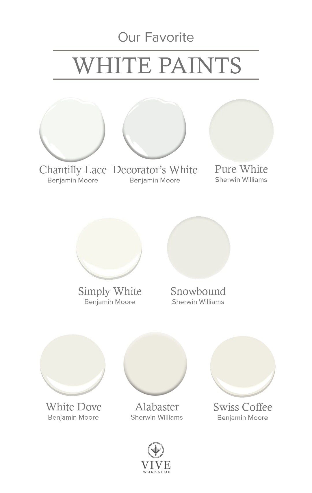
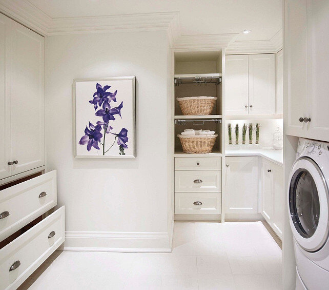
As I mentioned, Monday, paint consults have been my most requested service. Though some people are still wanting gray interiors, many are requesting white. But how do you make sure your white is right for your home? This is a tricky questions as white is probably the HARDEST color. I recommend you look at the undertones and try to coordinate it to the undertones in your materials. I am always someone who leans towards a warmer white as opposed to a cooler, stark white.
CHANTILLY LACE by Benjamin Moore
This is probably one the truest white I have on the list; it feels clean and bright. I used it with a sage color when color-blocking Julip’s old room and I loved the fresh feeling against the green.
Image via Homebunch
DECORATORS’S WHITE by Benjamin Moore
This may be the coolest I go with whites, although it still reads pretty true white. It has a subtle grey undertone that makes it work well with blues and in more modern homes.
Image via Homebunch
PURE WHITE by Sherwin Williams
This is a great soft white. Though its name says “pure” it does have a hint of warmth to it. However, it is not as creamy of some of the others on this list which makes it very versatile as a white with no cool undertones.
Image via Homebunch
SIMPLY WHITE by Benjamin Moore
I’ve used this in dining rooms, bathrooms, bedrooms…you name it! It’s a great warm white that almost glows and doesn’t read too yellow. If White Dove is too creamy for you, but you don’t want a stark white, this may the one!
Image via Homebunch
SNOWBOUND by Sherwin Williams
Snowbound is a white with some beige and grey undertones. I do find that it pulls a little more grey compared to some of the warm whites on this list, making it appear a little more bright and a little less creamy.
Image via Homebunch
WHITE DOVE by Benjamin Moore
I have used this color on all my trim and kitchen cabinets in the last house. Here’s the thing with this color, it is a very pretty warm white. It has both beige and gray undertones, but pulls a little more beige, making it feel like a timeless white. However, I have had clients select this color and Alabaster (below) to go with their tan backsplash, thinking it would look really creamy on their cabinets, and it looks much more bright white than they were thinking. Pairing this with anything brown instantly makes this color feel more bright because it is not an off-white.
Image via Homebunch
ALABASTER by Sherwin Williams
This is the closest comparable, from Sherwin Williams, to White Dove and my most requested white from clients. Like the color above, it has undertones of beige and gray, though it leans more beige. It is a beautiful warm white!
Image via Homebunch
SWISS COFFEE by Benjamin Moore
The creamiest of all the whites on this list; this can read yellow in some lighting because it doesn’t reflect light as much as the other whites. I am using a comparable to this in our current home because of the natural glow it gives off that almost feels European.
Image via Studio Mcgee
Stay tuned in all of this week and next for more spring refresh tips and sources:
April 1- Office Organization
April 2- Black Paint Colors
April 5- Closet Organization
April 6- Gray and Putty Paint Colors
April 7- Toy Organization
April 8- Blue Paint Colors
April 9- Our Favorite Rugs
April 12- Green Paint Colors
April 13- Our Favorite Wallpaper
April 14- Our Favorite Art
April 15- Our Favorite Accessories
April 16- Outdoor Update
Enjoy,
Nikki
Spring Refresh | Kitchen & Pantry Organization
Our favorite Kitchen & Pantry Organization Products
I’m a firm believer that your home should work for you. If you’re running around trying to find things, every day, the wasted time adds up. Pair that with your busy day and family dynamics and it can become an unnecessary frustration. That is where staying organized “behind the scenes” comes into play.
Every time I start to organize, I begin in the kitchen. It’s the hub of the home and is usually the place where your family begins their day together. There are a few areas where I focus my attention; let’s dive into those.
DRAWERS
Image via House & Garden
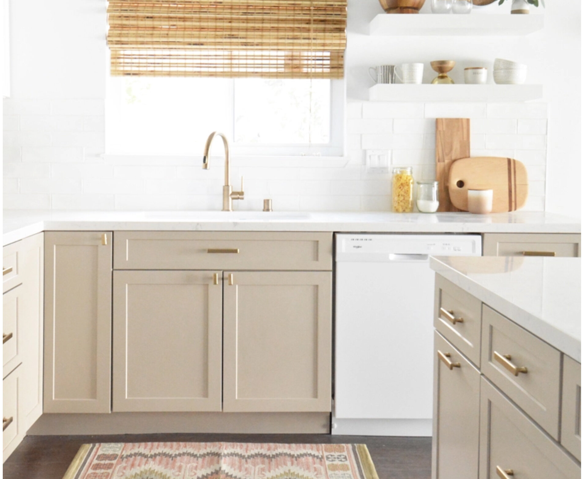
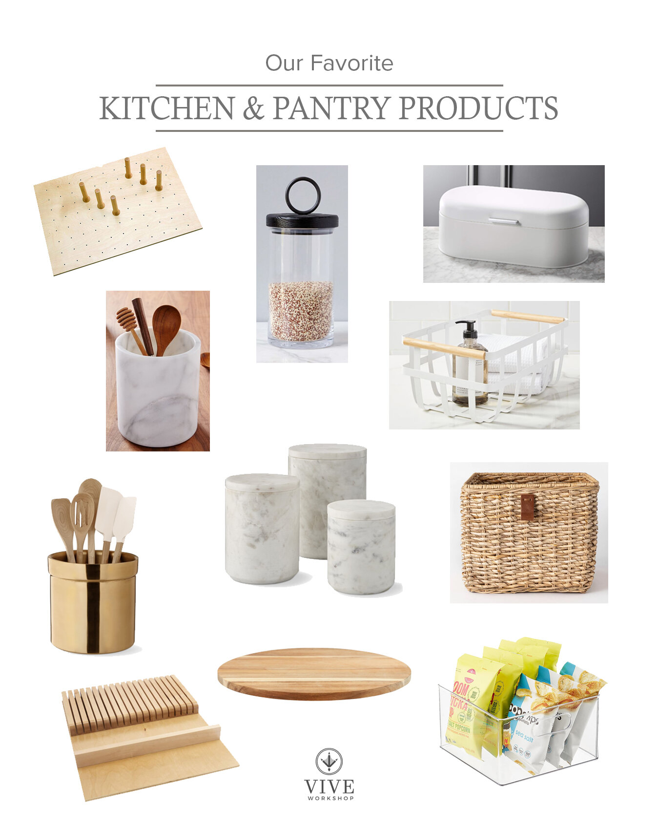
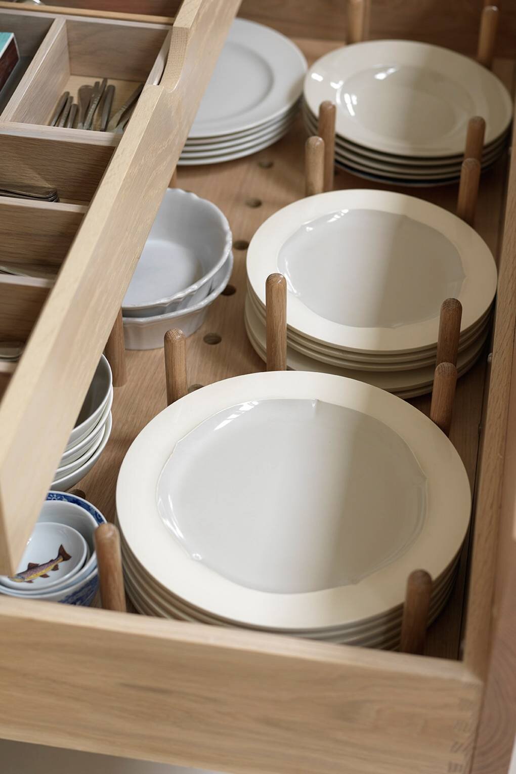
The kitchen drawers can became a cluttered mess of utensils when they aren’t compartmentalized. I love drawer organizers, dividers and trays. Peg systems for dishes can easily be moved around to accommodate different size plates. I also love these utensil trays that can be cut down to the size of your drawer to look like they are custom.
UTENSIL HOLDERS
Image via South Meets Lake Project
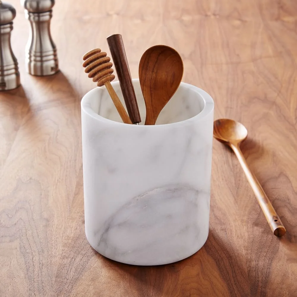
Large spoons, spatulas and tongs can take up a lot of room in drawers and they may be needed quickly when cooking. I love to put them in a utensil container in easy reach of the stove top. Since they are on the countertop I use them as “decoration” as well. You can coordinate the colors to the kitchen. I tend to lean towards wooden spoons, stainless steel, and gold utensils to keep everything neutral. These gold and marble containers would be the perfect compliment to a kitchen.
CANISTERS
Image via Anderson + Grant
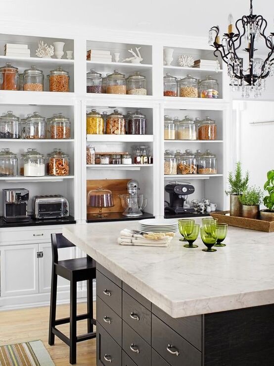
Canisters are great for flours, sugars, packets, cereals, granolas…you name it! I love a simple clear canister, but there are a range of options to suit the aesthetic of your kitchen. You can use them on pantry shelves or on the countertop.
BASKETS
Image via Creating This Life
I love having places to contain. My children love to get their own bags of chips, cookies, crackers, and bars. We both love that I can organize their favorites in baskets, at their level, to easily grab without messing up the whole pantry. I also like to categorize baskets for baking, snacks, teas, etc. I use both see-through and woven depending on the look I’m going for and how much I want to hide the items inside.
PANTRY EXTRAS
Image via The Container Store
The pantry is a mix of bags, boxes, jars, and cans; using just one storage solution won’t work. I have also found that many shelves are too deep and sometimes too tall for the products. Instead of re-designing the shelves, I like to find solutions to be able to utilize every inch of the pantry. Keeping your breads separate from other items helps to keep it from getting smashed. I use either a bread box or basket that hangs below the shelf with shorter objects stored below it. I also love to use a lazy susan in deep areas, like corners.
Tomorrow we’re sharing our favorite white paints! Here is the rest of the line-up:
March 31- White Paint Colors
April 1- Office Organization
April 2- Black Paint Colors
April 5- Closet Organization
April 6- Gray and Putty Paint Colors
April 7- Toy Organization
April 8- Blue Paint Colors
April 9- Our Favorite Rugs
April 12- Green Paint Colors
April 13- Our Favorite Wallpaper
April 14- Our Favorite Art
April 15- Our Favorite Accessories
April 16- Outdoor Update
Enjoy,
Nikki
Spring Refresh | Exterior Paint
Our favorite neutral exterior paint colors.
Spring is here and refreshing your home may be at the top of your list as the weather warms up!
Over the next 3 weeks I’m going through some of my favorite colors, organization products, and decor to refresh your home. The TOP request I get from client inquiries, this year, is paint color consultations. Covid has everyone stuck at home, staring at the walls and really wanting to make some changes. Today we are looking at exterior home colors. Exterior siding is popular in certain areas, and painted brick has been gaining popularity over the years. If you’re painting your brick, I recommend Ramabio Masonry paint; it’s what we will be using in a couple weeks on our new home.
It’s important to note that lighting, including natural light and the way a room faces, and other materials can influence the way a color looks so although it may be my favorite it may be totally different in your home. I ALWAYS recommend testing out three samples, at 2’ x 2’, on your wall and leaving it up for a couple days to look at. Exterior lighting is much more harsh than interior so if you’re going white, I prefer a soft white; especially in this Texas sun!
SNOWBOUND by Sherwin Williams
If you’re looking for a paint color that is not too creamy, Snowbound may be right for you. It has a slight amount of gray to dull the white a little, giving it a soft appearance. At an LRV (light reflective value) of 83, it is slightly less reflective than the brighter white like Pure White (SW) and Simply White (BM). Going over 85 will result in a bright white.
Image via Homebunch
WHITE DOVE by Benjamin Moore
If you are wanting the look of a white, modern farmhouse, White Dove would be a great choice! It has a warm under-tone so it pairs well with wood tones and stone. It reads slightly off-white, having a hint of gray, but with an LRV of 85 it appears brighter than Snowbound.
Image via Kroiss Development
SHOJI WHITE by Sherwin Williams
Shoji White has a mix of grey and beige undertones, making it read as a light greige. Because of the beige it can sometimes take on a “pink-ish” hue. With an LRV of 74, Shoji White will still appear white but with a creaminess that is less harsh.
Image via @mrsparanjape
OYSTER WHITE by Sherwin Williams
If you’re wanting to move into slightly more off-white, Oyster white may be a good pick for you. It’s LRV is about 74 so it will still read as a white, but the beige and grey undertones create a sense of warmth. This color would be perfect for a home with a more traditional architecture. This warm white looks beautiful on painted brick and with wood and dark tones.
Image via Willow Homes
NATURAL CHOICE by Sherwin Williams
This is another great creamy off-white for those who don’t want a bright white. The LRV is 73 making it the least bright of the five I have listed. The under-tones of grey and beige give this color some depth, but when comparing it to Oyster White, I found Natural Choice had slightly less gray. If you’re in a traditional community that is scared of white, this is a great one to use! We are actually using this on our new home.
Image via Homebunch
REPOSE GRAY by Sherwin Williams
For a light warm gray that doesn’t appear too stark or cool, I like Repose Gray. In some lights, this gray can appear like an off-white similar to the colors above. If, you are wanting a versatile color that doesn’t have too much beige, this is a great choice!
Image via Homebunch
DORIAN GRAY by Sherwin Williams
I always try to avoid grays with a blue under-tone unless I want the color to look blue, so for a good mid-tone warm gray this is perfect! It is a timeless neutral that still has depth.
Image via Hask Custom Homes
GAUNTLET GRAY by Sherwin Williams
This gray is still warm, but is a little darker. It goes well with traditional farmhouse architecture and ties into wood tones, black, white, and stone very well. If you don’t want a beige but still want your home to have a classic feel, this is a great choice!
Image via The Gray Cottage
URBANE BRONZE by Sherwin Williams
I love a classic bronze finish and this color is that, in paint form! Urbane Bronze is a darker gray with more brown undertones that make it appear bronze. In darker lighting, it can appear almost black, but if you are not wanting to go stark black, gray, or brown than this is a perfect mix.
Image via Rugh Design
IRON ORE by Sherwin Williams
This is a deep “almost black” charcoal color. I love this for a traditional siding home with a white trim or on a more modern home. The green of the landscaping really pops off this color.
Image vis @housesevendesign
ONYX by Benjamin Moore
If you want drama, this is the color for you! This black has a warm undertone which makes it feel a little less stark than a true black. This color is suitable for both modern and traditional homes.
Image via SF Girl
I hope this guide helps you in your exterior refresh! Stay tuned in all of this week and next for more spring refresh tips and sources:
March 30- Kitchen and Pantry Organization
March 31- White Paint Colors
April 1- Office Organization
April 2- Black Paint Colors
April 5- Closet Organization
April 6- Gray and Putty Paint Colors
April 7- Toy Organization
April 8- Blue Paint Colors
April 9- Our Favorite Rugs
April 12- Green Paint Colors
April 13- Our Favorite Wallpaper
April 14- Our Favorite Art
April 15- Our Favorite Accessories
April 16- Outdoor Update
Enjoy,
Nikki
Industrial Hangout Project
Almost two years ago, a repeat E-Design client contacted me to help them with a metal building addition. They wanted a comfortable, industrial-style space to be used for entertaining and hosting for company, family, and school functions. This project is in Oklahoma and was more than a typical e-design project because of the level of detail. We did everything remotely via emails, phone calls, and occasionally face time. It’s amazing what wonderful results can come from working well as a team.
This addition is one large, open room that serves several functions. The first thing I did was work on space layouts. It became clear that we wanted to divide the space into three zones.
THE GYM:
The husband is an Iron Man who trains, regularly, for triathlons so the first requirement was to move the current work out space, located in the main metal building, to the addition. The second requirement was to convert the current office in the main building into a spa-like bathroom with lockers for everyone who comes to work out; including their three boys.
This bathroom would have access to the main building, but also needed to be accessed by the new gym so we made sure to locate it just off the bathroom. The lockers have a space for shoes below, a basket above, and doors with mesh screens. A bench is centered between the shower and lockers for changing, and the laundry cart next to the lockers holds dirty towels. Behind the industrial vanity is a statement wall of square black clay tile.
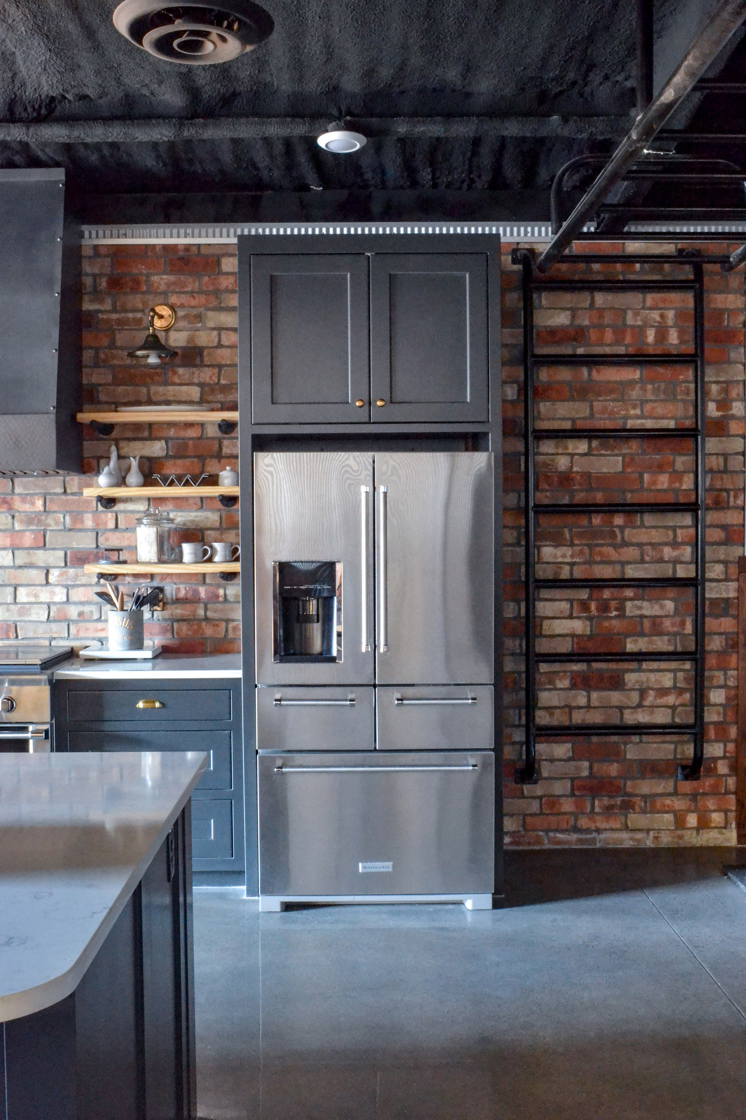
The client really wanted monkey bars somewhere so we used that as our “divider” between the gym and entertaining spaces. The entertaining portion includes a full kitchen and a lounge area where they can project movies. The monkey bars serve as a great transition space and provide plenty of entertainment whenever guests want to have a friendly competition.
THE KITCHEN:
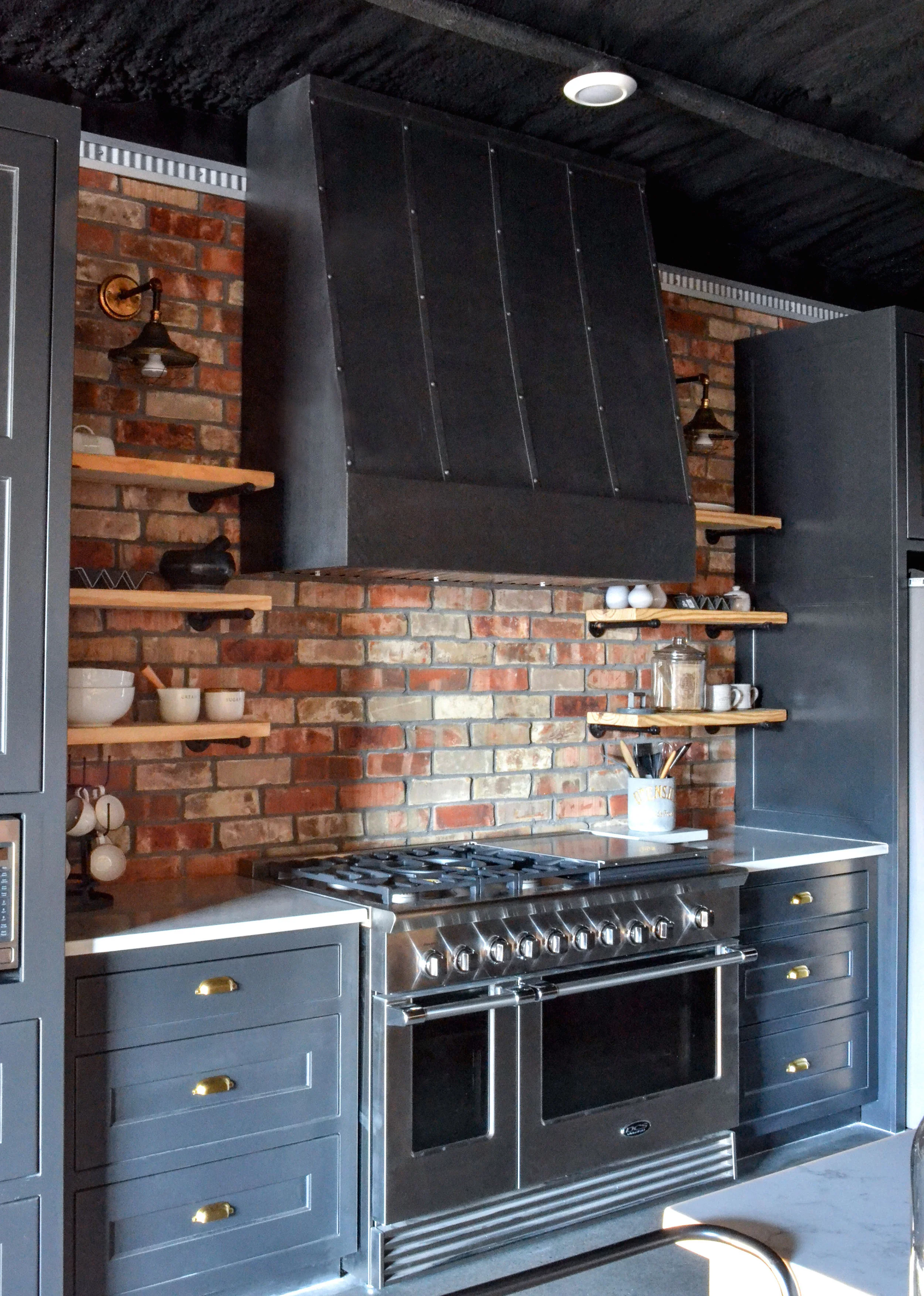
The homeowners already knew they wanted large barn doors to open into this space. I used that visual as an opportunity to highlight the kitchen. We put the hood directly in front of the door which was centered on the wall from the main building. We also had some room for a hand-made farmhouse table. Holiday meals and game nights will happen here.
We tried to infuse the space with industrial details, while keeping warm tones like wood and brass to make it feel more comfortable. The barn doors are a warm wood with a rich grain and diagonal detail. The wood can also be seen wrapping around the lower portion of the walls. In the kitchen, grey-black cabinets were paired with a white quartz and brass hardware. I always try to mix metals in a kitchen to create a layered look. One of my favorite elements is the floor-to-ceiling brick behind the cabinets. It was a great way to add texture and reinforce the kitchen “zone”.
The large metal hood makes a statement over the 48” range. We used open shelving on each side with industrial sconces to light up the items on display and add light to the work surfaces. A bar cart sits against the lounge side of the island to create an open-shelf extension that can be moved to the game areas whenever needed.
THE LOUNGE:
The lounge area was placed in the front of the building, next to the large, black steel window. This area needed to be comfortable and versatile. A large charcoal and white rug anchors the space. Card games are stored on the coffee table for easy access. A projector shines onto a wall-mounted screen for family and friend movie nights. Behind the sectional is a shuffle board table, lit with sconces that flank a deer mount from the family’s hunting ranch.
Red Dirt Relaxed Project
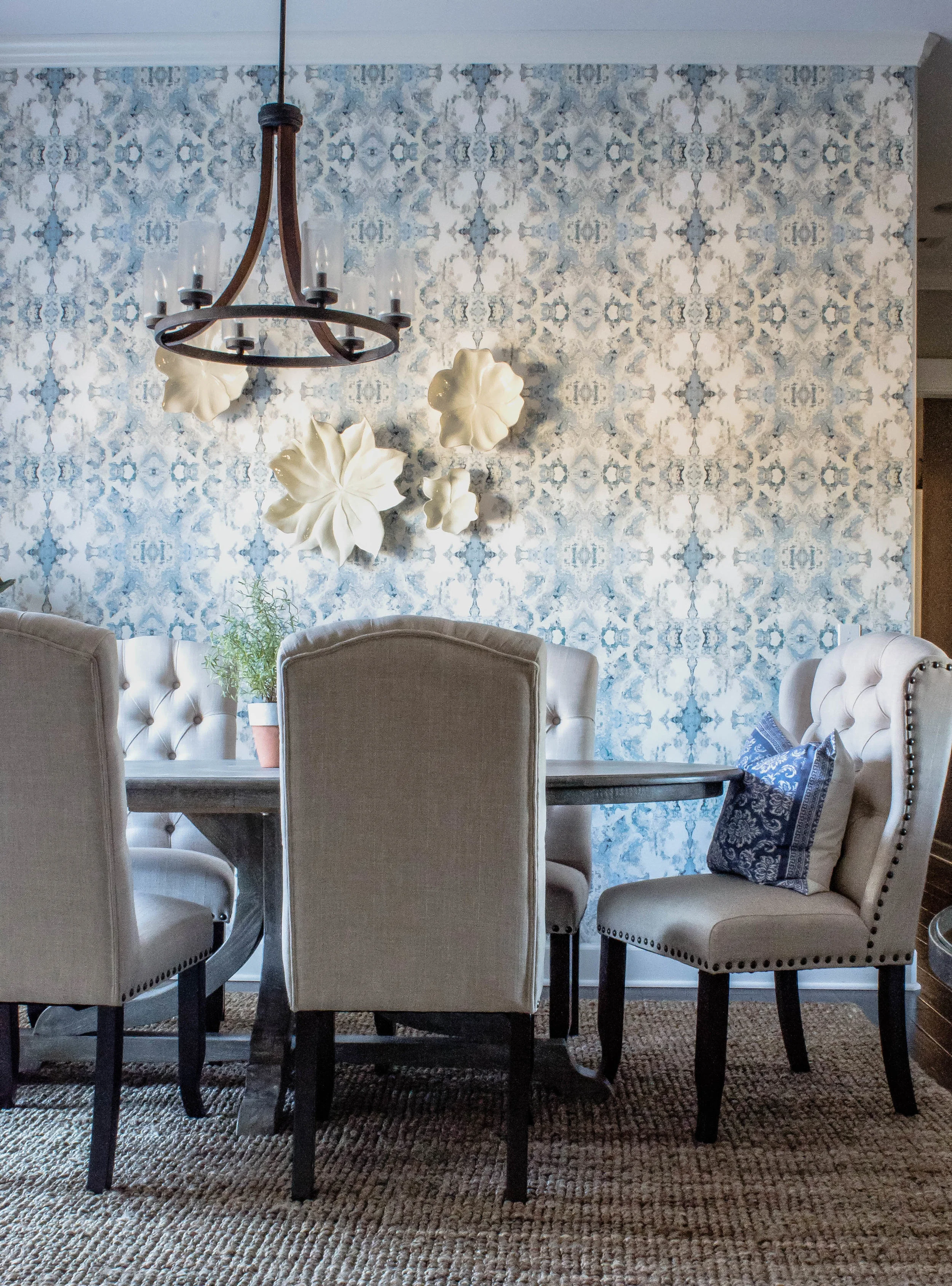
I was recently able to travel and photograph an E-Design project I completed last summer. This home is the couple's 18th move! Yes, you read that correctly. You can now pick your jaw up off of the floor. The wife is a real estate agent who really knows how to select a good home and has an amazing sense of style, but after 18 moves is burnt-out of constantly having to decide how to do each of their homes. On top of that, she was getting tired of her tan, red, orange color scheme and wanted a change. She really wanted something that she wouldn't normally select, so she contacted Vive Workshop. We started in her dining room, as it was the most bothersome to her. It is open to the family room and the large table she brought with her just didn't seem to fit. She is also not a huge fan of art. She wanted something that could draw the eye's focus on the back wall, but didn't clutter it with a lot of heavy items. I selected a gorgeous printed wallpaper that wasn't too bold, but added some of the relaxed, fresh blue she was wanting. Because the room is only two walls and the curtains would be covering one of them, we decided to just wallpaper the wall you see when you walk in the front door.
I selected an oval table that was large enough for seating several people, but wouldn't block the walking path. We kept the room pretty neutral besides the paper. We selected natural, white curtains and chairs that paired well with the textured woven shade and rug. White flowers layer on top of the wallpaper to add interest, but not weigh the wall down.
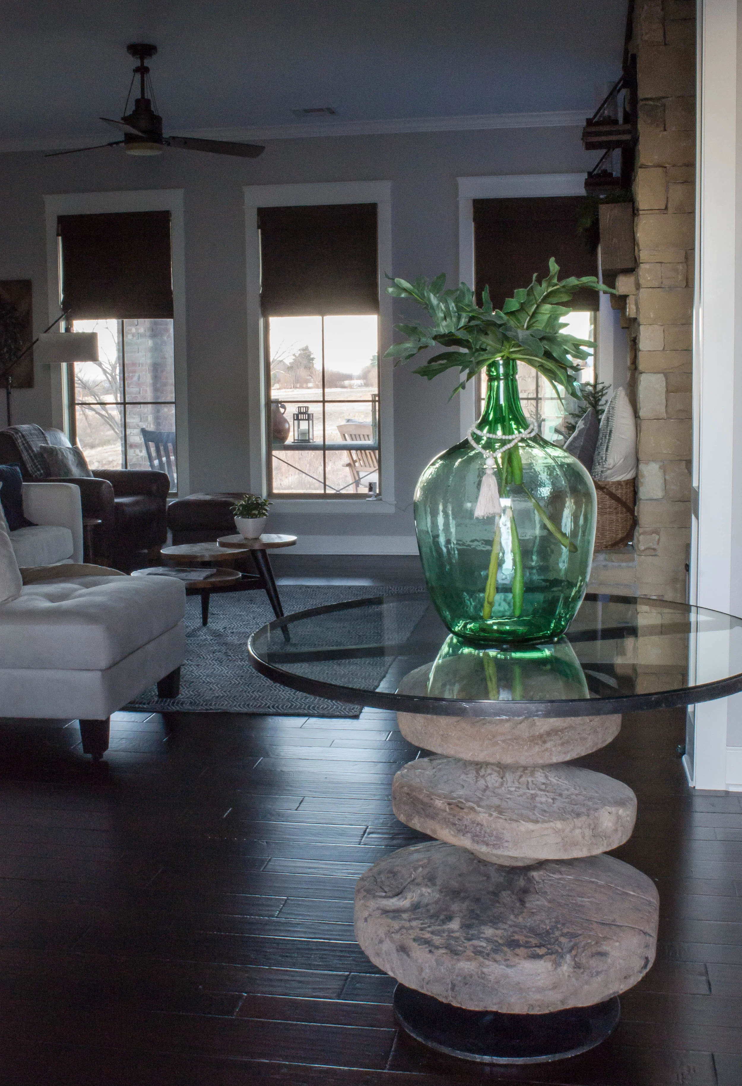
Her entryway needed a small anchoring piece of furniture and nothing seemed right. Then, by a stroke of luck, I found this amazing round table. It adds the perfect amount of character without trying too hard.
Lastly, her family room didn't feel finished. There were cabinets on each side of a large, stone fireplace that felt dwarfed, in scale. She also felt like all the dark wood felt broken up. We decided to make the wall appear as a cohesive set of built-ins. We installed ship-lap above the cabinets and had both sides painted a color that would serve as a transition between the grey walls and slightly golden-hued rock. It's amazing what paint can do! After mounting their tv on the left side, we found a botanical art that she already owned to hang on the opposite side and give the impression of symmetry.
I hope you enjoyed this tour! To find out more about the services we offer, click here.
Nikki
South Meets Lake- Cottage Tour- Part 3
At the beginning of the year, I shared part 1 and part 2 of the #VWSouthMeetsLake Cottage Tour. It's safe to say that these last two rooms are long overdo. If you've missed or forgotten what the cottage looked like, simply click on the links above. Honestly, posting about this cottage in the summer time seems much more fitting. There are traces of the water, nature, and nautical life throughout this cottage. The main color scheme of the house is blue and green, but accents of warm tones run through-out, as well.
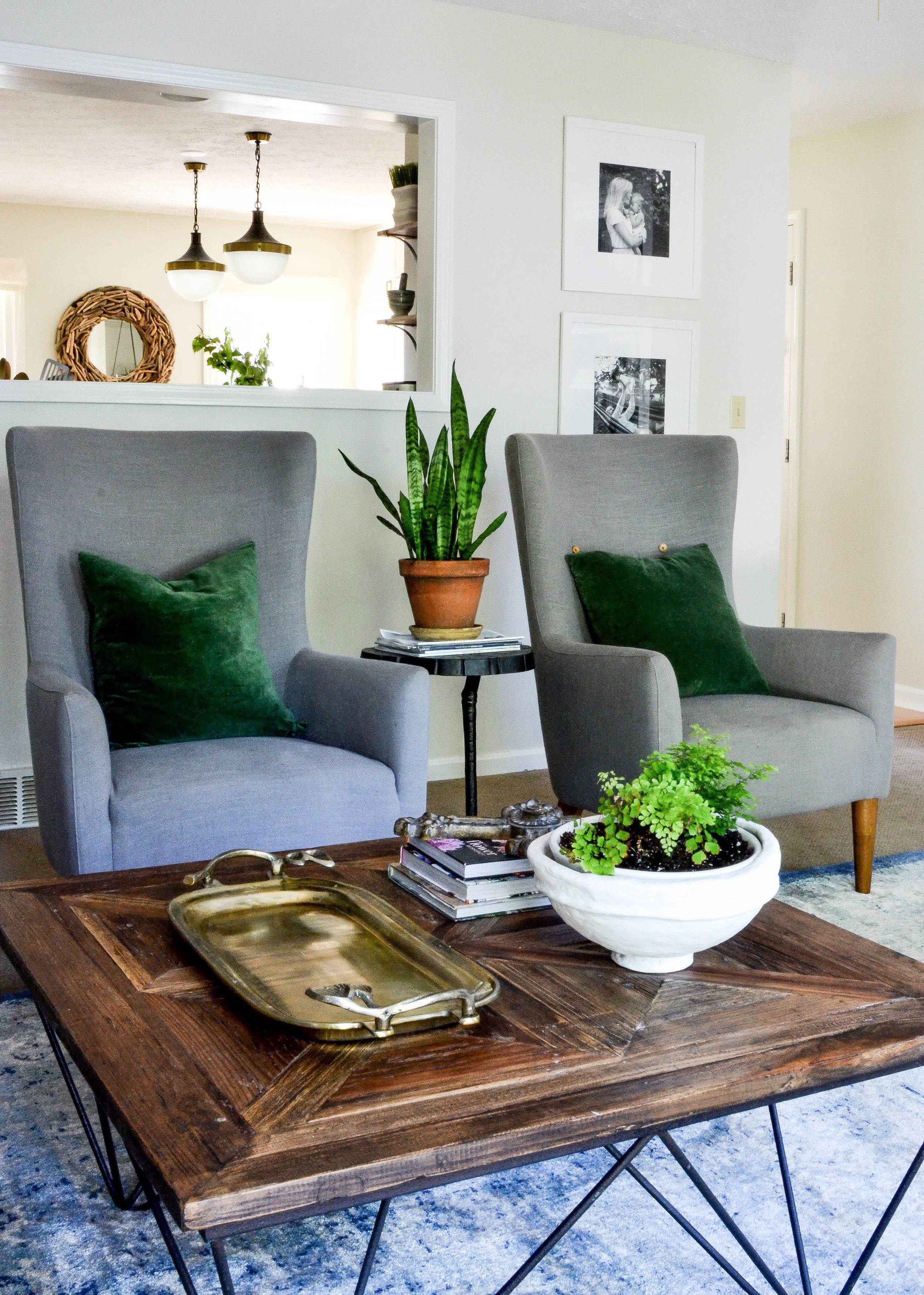
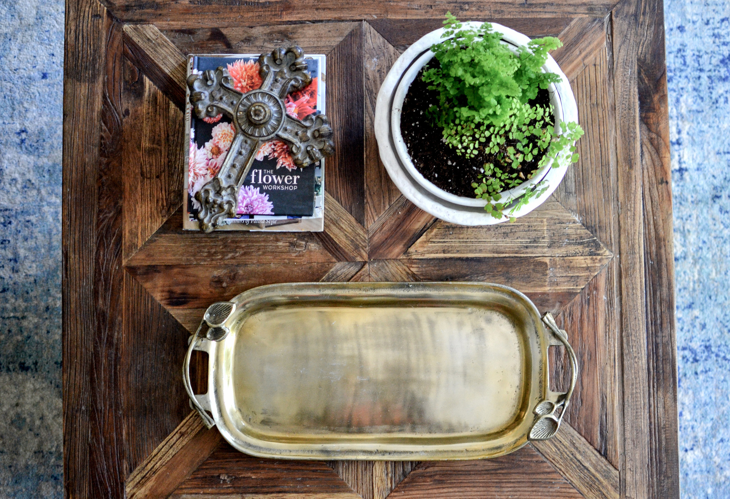
The family room is right off of the kitchen and overlooks the backyard. This room gets the best light in the house, so it's where the majority of the plants reside. The family spends most of their time playing and relaxing in this room. I wanted it to have some southern charm so I used a coffee table with a rough wood finish, antique accents, a chesterfield sofa, and a large picture of a live oak tree over the sofa. Just like every other room in the house, nothing is too precious. I mixed materials and patterns to create interest, but also so that if something ever needs to be changed out, it can be done without making it look like a piece of a "set" is missing.
Photo from real estate listing
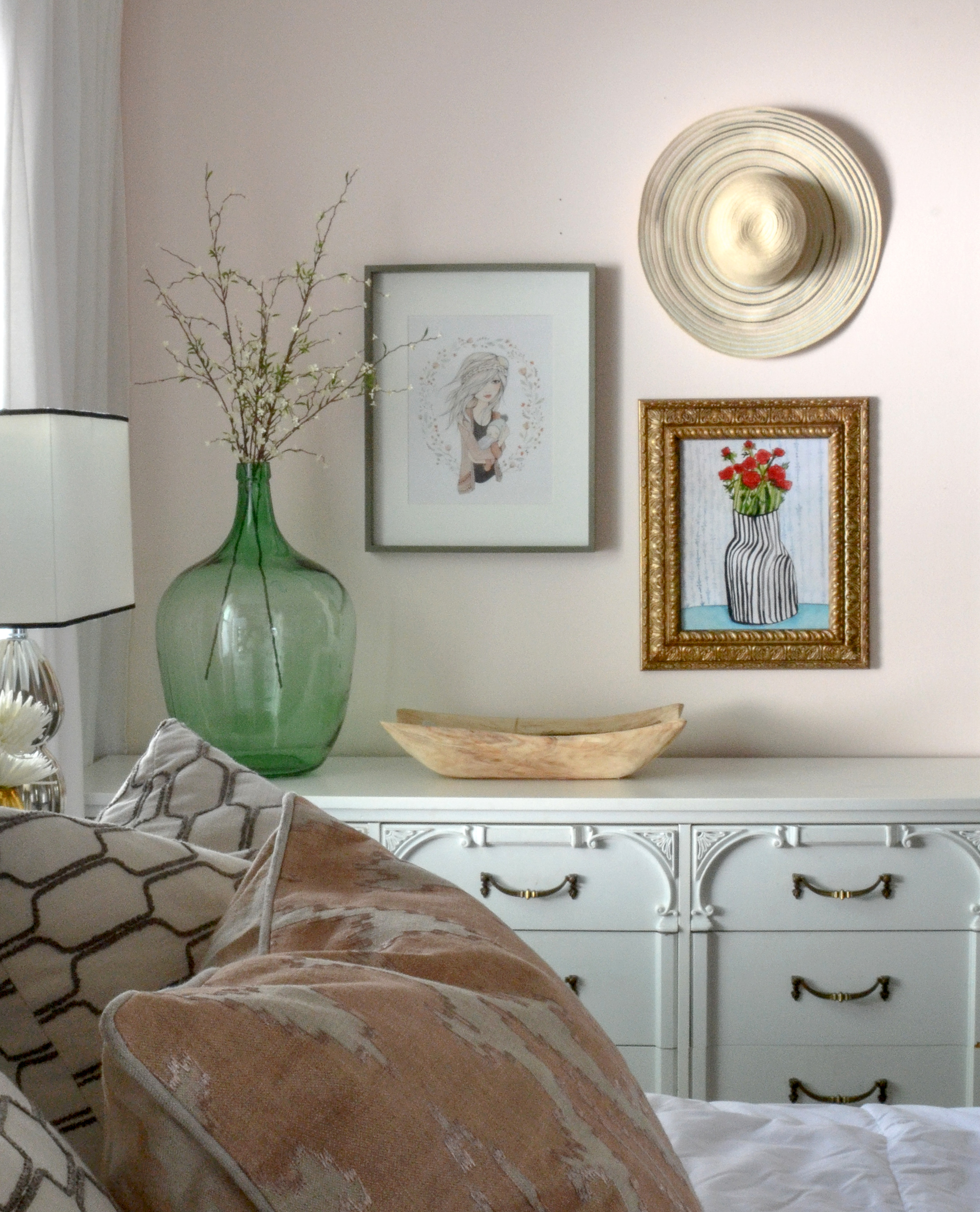
The Master Bedroom is next to the family room. This room has a window, doors to the bathroom and backyard, and large closet doors which leaves very little wall space for furniture. Any furniture that was used needed to feel light and fresh so that the room wouldn't feel weighed down. Along with that, I wanted to use a paint color that would bounce light and still give the room a calming feeling. I went through so many paint color samples and NOTHING I had used before felt right. I finally landed on pink, of all colors. Getting the correct shade of pink was crucial to make sure it would not feel like a baby girl's nursery.
Pink can really intensify once it's covering the walls, but this pink feels like a warm, glowing sunset over the water. I combined it with accents of black, blue, and green to pull it a little more towards the masculine side.
I hope you’ve enjoyed this home tour. To get more design inspiration follow me on instagram and pinterest.
Nikki
Bay Dream Kitchen Reveal
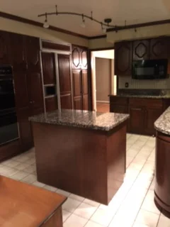
Last fall, I was contacted to help bring a family's vision of their dream kitchen to life. They had moved into their home a couples year earlier, knowing that they would eventually redo the dark and dated kitchen. Not only was the kitchen dark, it also wasn't functioning well for a young, busy family. The table where they had most of their meals was next to the family room (behind the kitchen), there was a formal dining room next to the kitchen, and a formal living room in front of the kitchen and dining. With three young kids they wanted to take advantage of all unused the space.
Here's the before:
View from family room
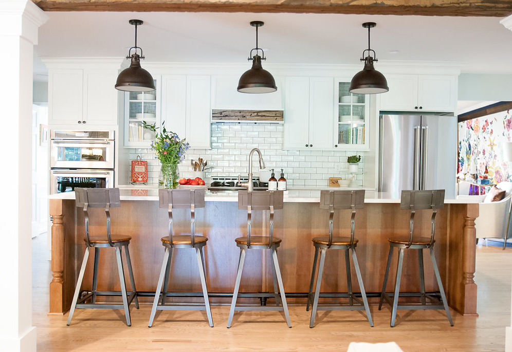
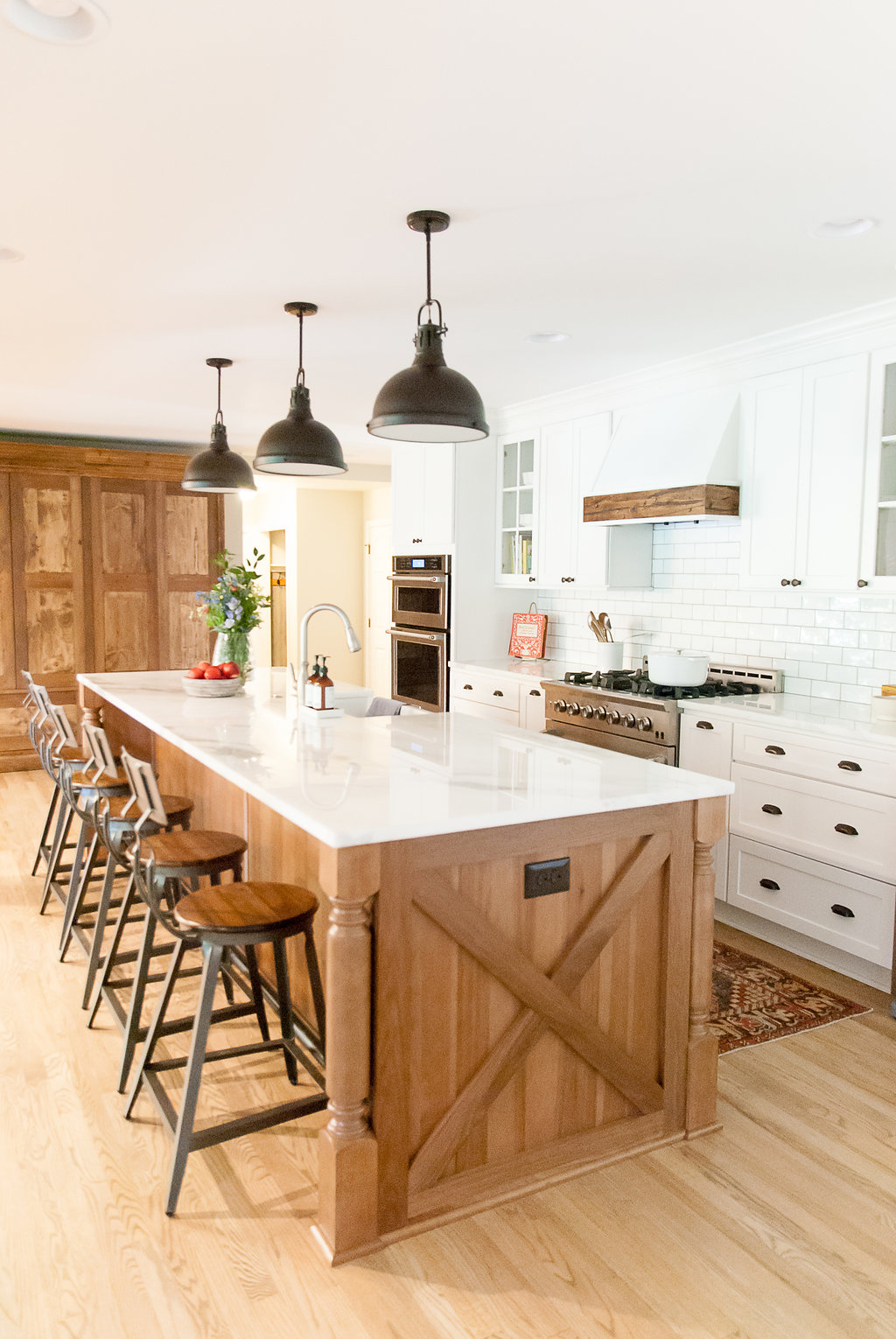
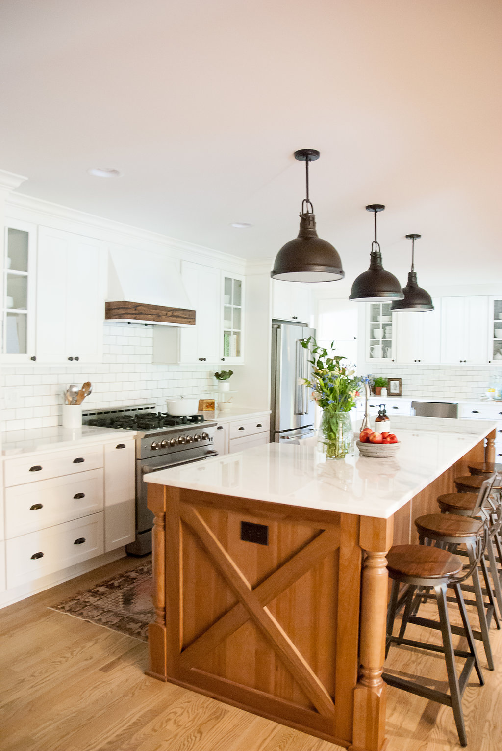
We decided to open up the wall between the existing kitchen and formal dining room to create a large kitchen. We also removed the load bearing wall between the kitchen and family room to allow for more light and give the area a better flow. I designed a large island that seats the entire family and stretches across the kitchen. The two columns that take the place of the wall line up with the island, and a large wooden beam that coordinates with the vent hood runs the length of the kitchen to give the impression of separation from the family room.
The homeowners wanted a timeless kitchen that was mostly white, but that had an "organic and farmhouse" feel. They had a a sliding barn door with a diagonal trim piece, in their family room, that we took inspiration from for the island detail. The combination of white and wood grain always feels so balanced and timeless. Details like the vintage runner, patterned wallpaper on the back of the glass cabinets, and greenery added to the organic feeling.
Photography: Sweet Magnolia Photography
Contractor: Bennett Builders
South Meets Lake- Cottage Tour- Part 2
Today, I'm sharing part 2 of the #VWSouthMeetsLake cottage tour. I showed images for the entry, dining, powder bath, and the kitchen in part 1. Now, I'm taking you to the second floor of the house. The stairway is across from the entry, so you can see a glimpse of the small hallway when you walk into the house. I wanted it to spark some interest and give a hint of the fun that happens upstairs (the kid's area). I arranged a large collage of art collected over the years and included art done by the kids.
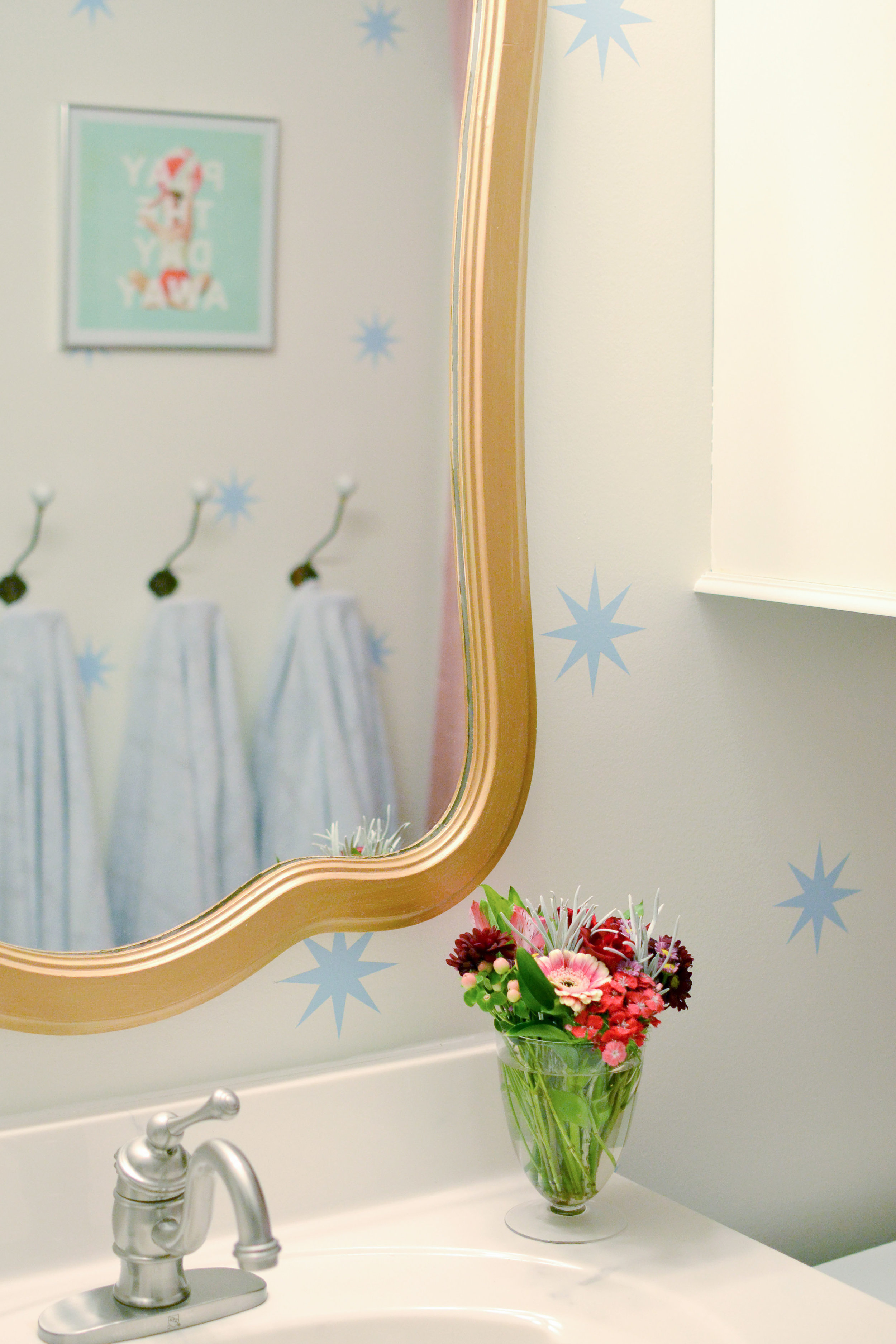
The kid's bathroom didn't change too much. A new mirror, wall hooks, updated paint, and wall decals refreshed the room and made it feel like a fun space. Small bathrooms are great places to add pattern to walls (decals or wallpaper) because the small area is better for your budget and is not as big of a risk as an entire, large room. So if you want to make a statement somewhere, but are a little nervous, start with a bathroom.
Before Bathroom
After
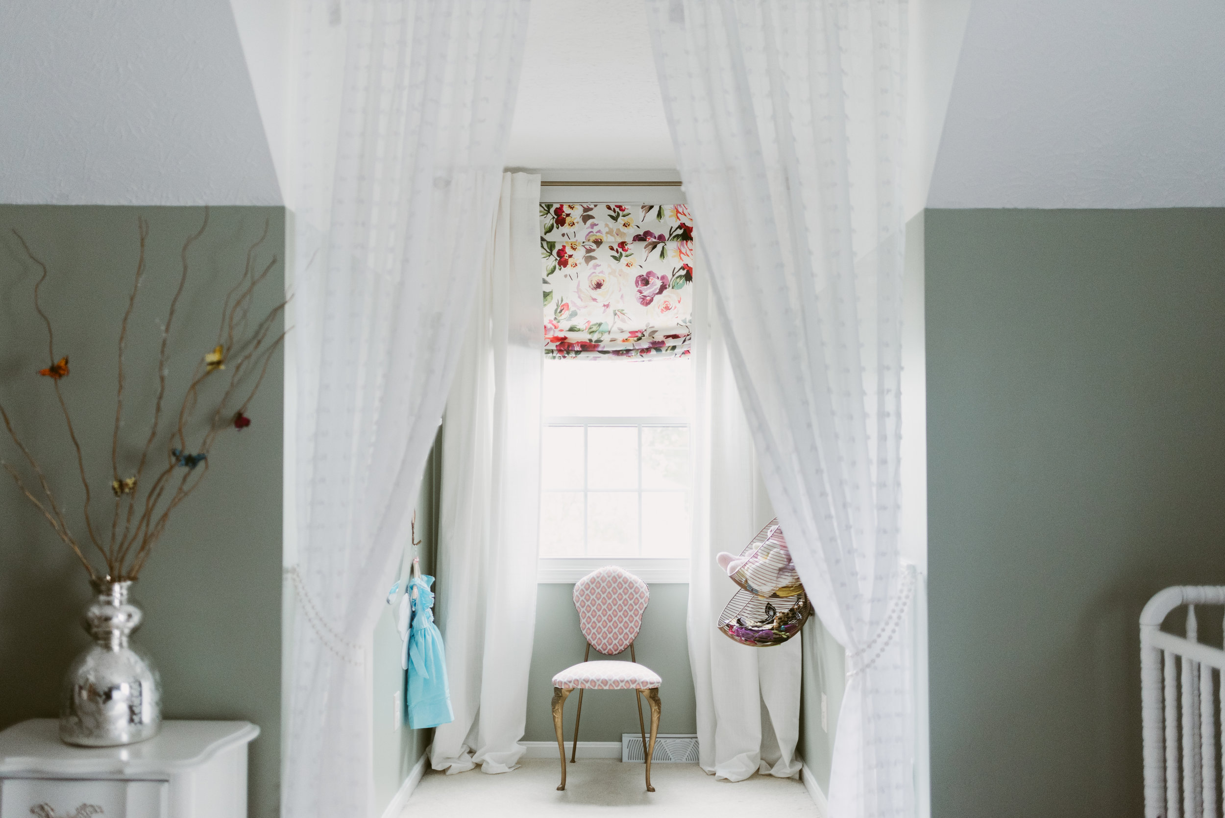
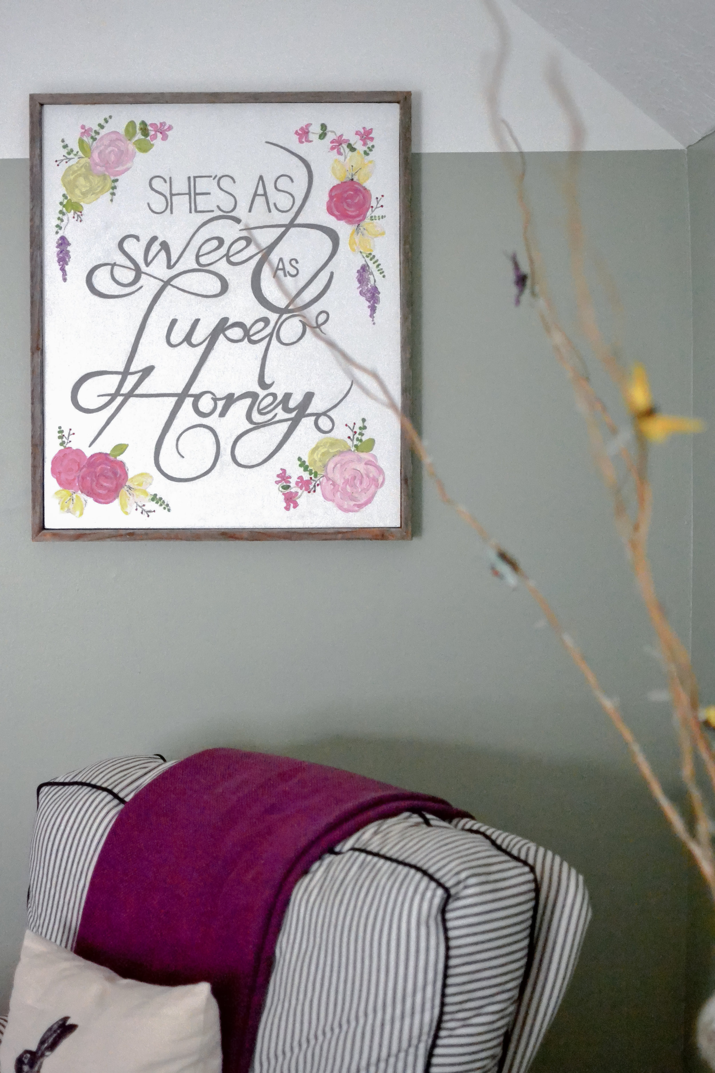
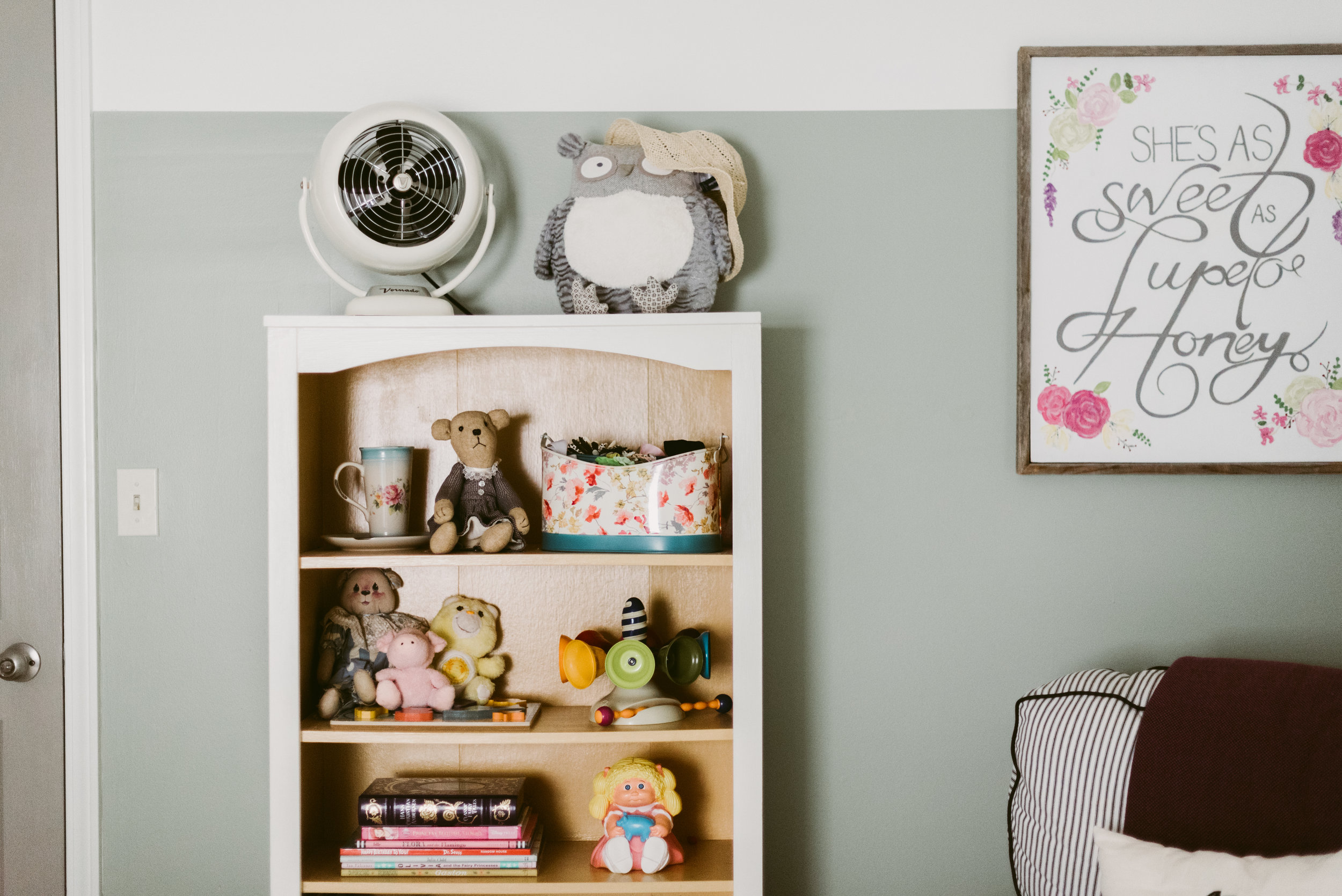
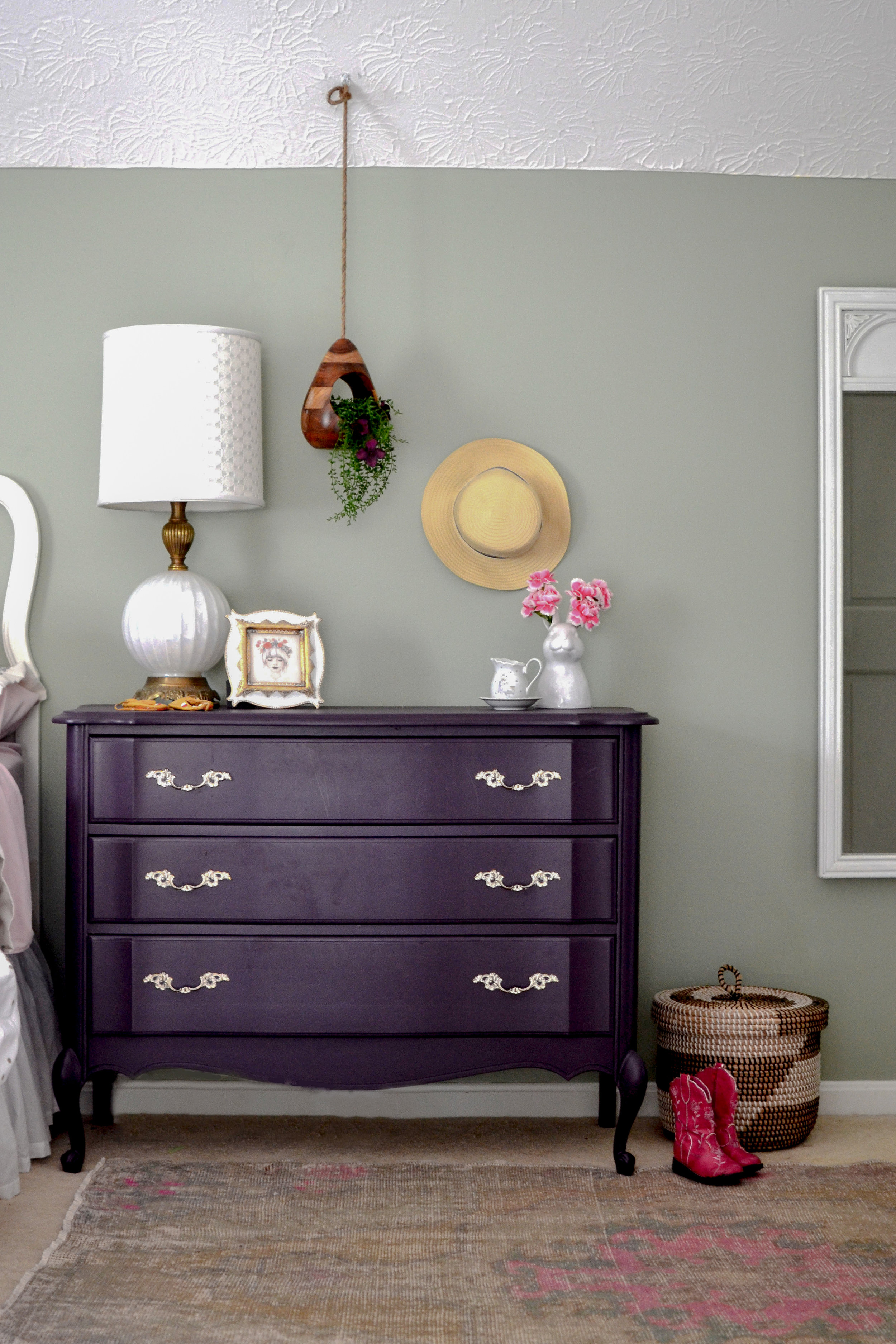
The little girl's nursery is a HUGE room, so arranging the furniture to fill the space but not letting it get too cluttered was a challenge. I used a rug and furniture groupings to create different "sections" in the room. I wanted to keep the walls gender neutral in case the kids share a room in a couple years, so I added the girly touches through textiles, furniture, and accessories. The furniture was re-used from 3 different spaces, but it was key to try and keep the lines similar.
Before Pic
The before picture shows just what a big difference paint can make. The color-blocking paint trend is also a great way to de-emphasize the diagonal ceiling/wall in an upstairs space. Make sure the "break" in color starts at the bottom of the diagonal and continues throughout the room.
Guest Bed
I separated the dormer area with a textured, sheer curtain to created a little play space and reduce the scale of the room.
Dormer Window
Both kid's rooms have attic access doors that originally were flat panels that had screws to close them. We updated the look of the doors and added hinges so they would open as doors. One of the attic spaces has wired lights and connects the rooms. We have started adding carpet squares and chalkboard walls to create a little playroom/hide-out area. I will share when it is finished.
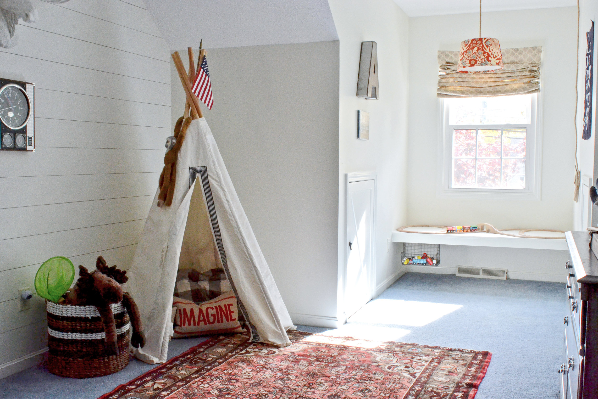
Next, the little boys room. This room had blue carpet that was in decent condition and wasn't in the budget to change out. The initial design stage focused on creating a room that would work with the blue, and make it look purposeful. While there isn't a "theme" in the room, since the house is a lake cottage, the "lake house" vibe is very fitting.
After
Before
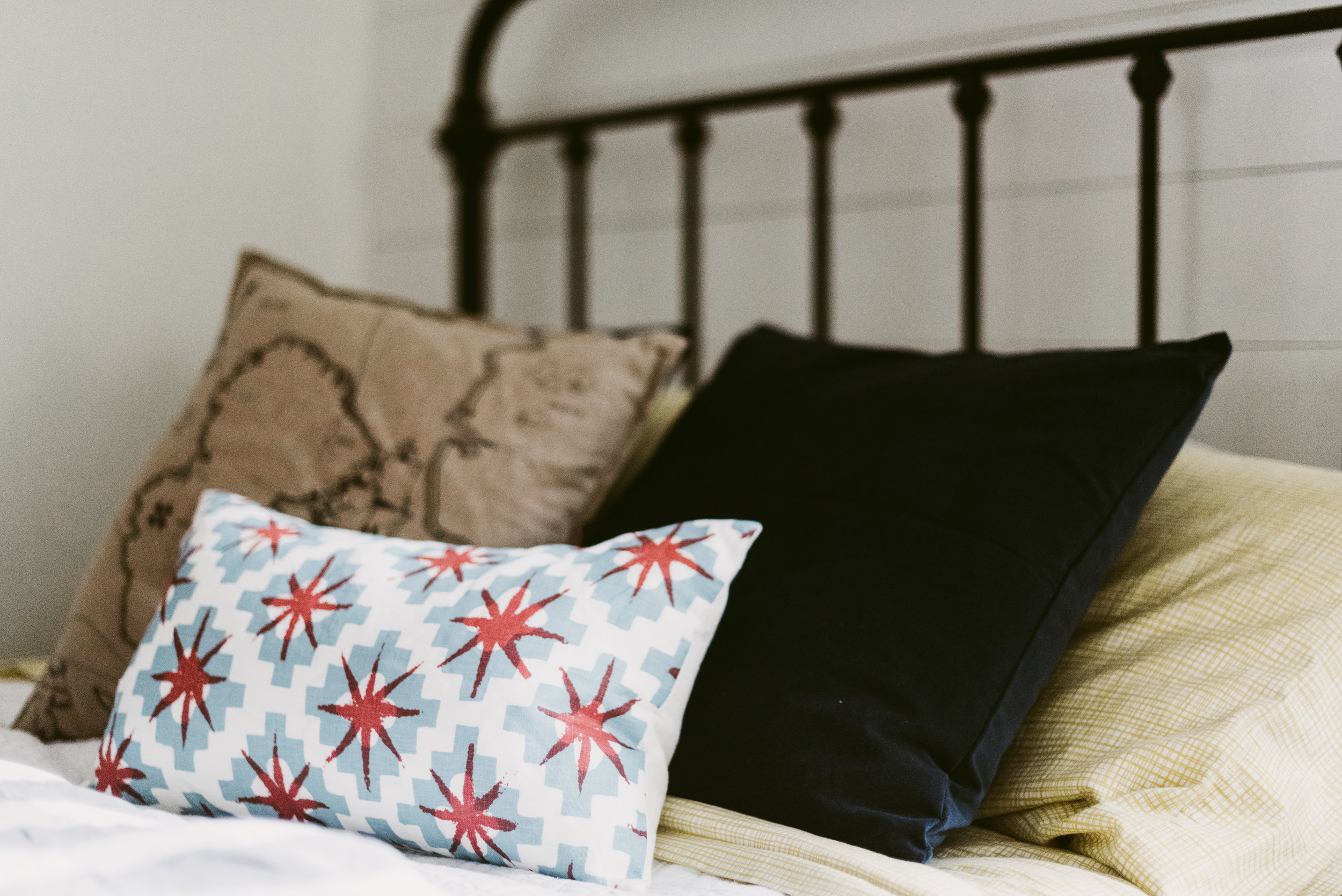
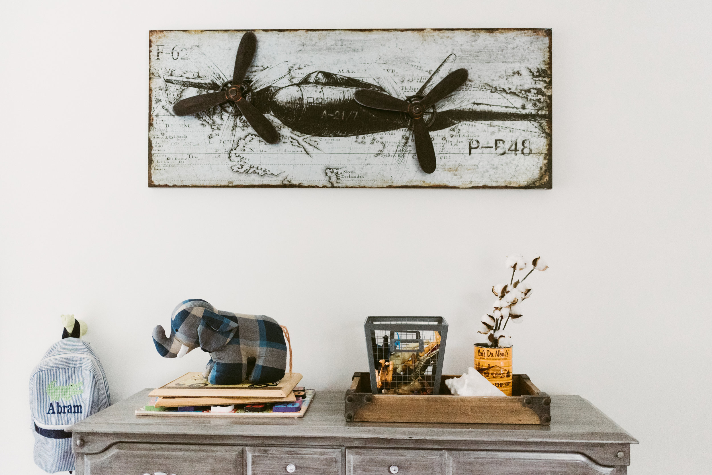
I had the walls painted white and installed shiplap to the back wall to add interest. There are red/orange and blue details throughout the room to give hints of "nautical". I also installed a floating window seat in the dormer. This seat can be used for reading when he gets older, but for now serves as the perfect train table.
Part 3 (the living room and master) are still in progress and will be posted whenever they are finished. I hope you've enjoyed this home tour. To get more design inspiration follow me on instagram and pinterest.
Thanks,
Nikki
