South Meets Lake- Cottage Tour- Part 1
Today I'm sharing part one of the #VWSouthMeetsLake Cottage Tour. Built in the 90's, this cozy cottage (less than 2,000 sf) was in need of some very budget-friendly updates to make it a place a young family of four could enjoy. I've been working on the updates to this home, slowly, for the last year. Located just walking distance from the shores of Lake Erie, it was designed with the traditional cottage front porch that everyone loves. However, some of the interiors felt dark and closed off from the other areas.
I took inspiration from the nature all around Lake Erie, and tried to tie in fun color and pattern representative of a young, fun family. A big goal for this design was to make the interiors feel stylish enough for the adults, but not too precious that the young children couldn't enjoy it.
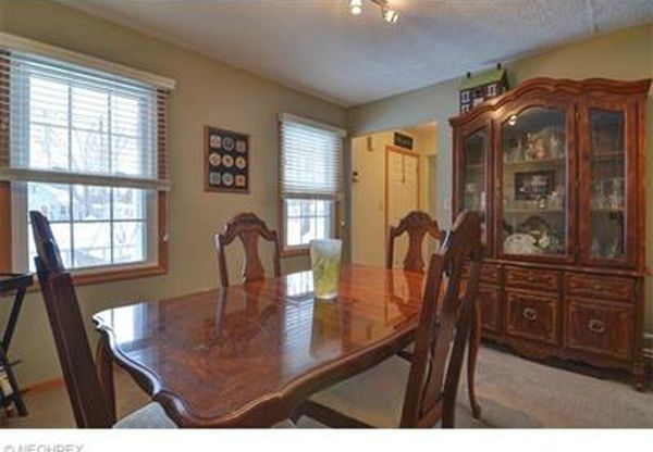
Before, the dining and entryway were pretty closed off and dark. Separating the dining room from the rest of the house left it feeling more like an office than a dining room.
Dining Before
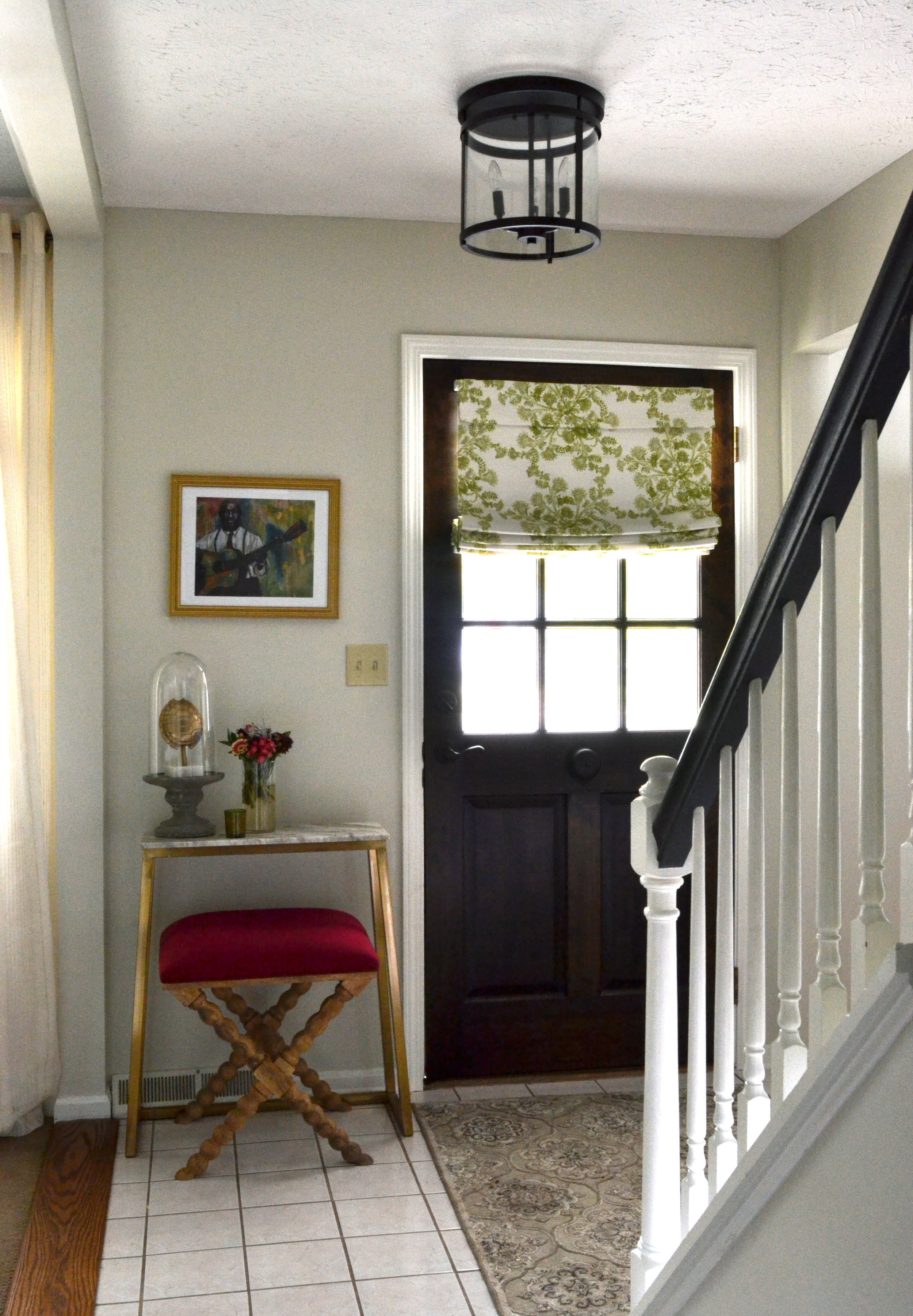
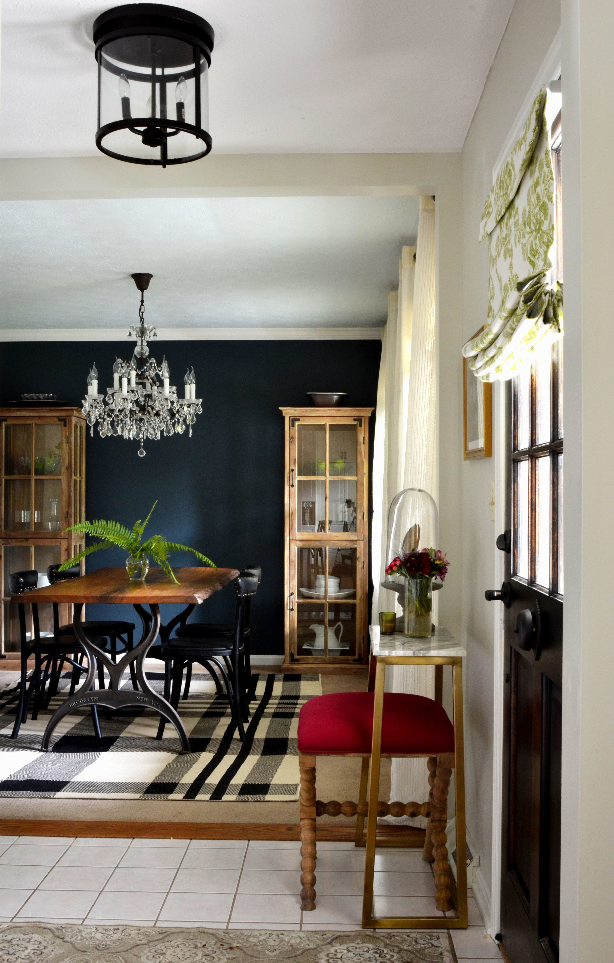
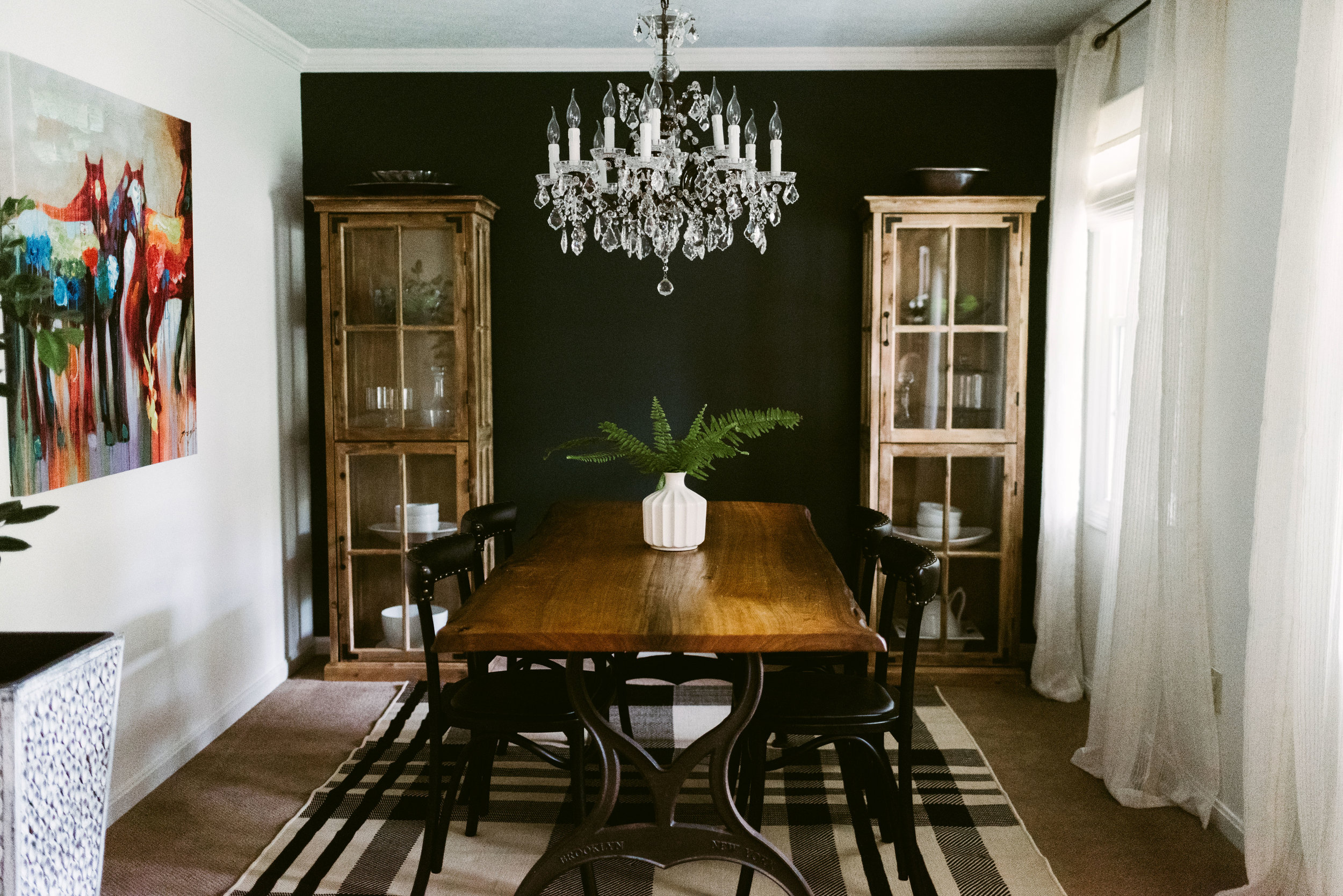
I had the wall between the entry and dining room opened up and installed a new, wooden door with glass to let in more light. Painting the back wall of the dining room and placing a curio cabinet on each side helps to create a more dramatic backdrop verse the pass through that it was before.
Dining Before
The powder bath is as small as you can get and still be functional. I just wanted to keep it simple with a white wall on top and black shiplap under the chair rail.
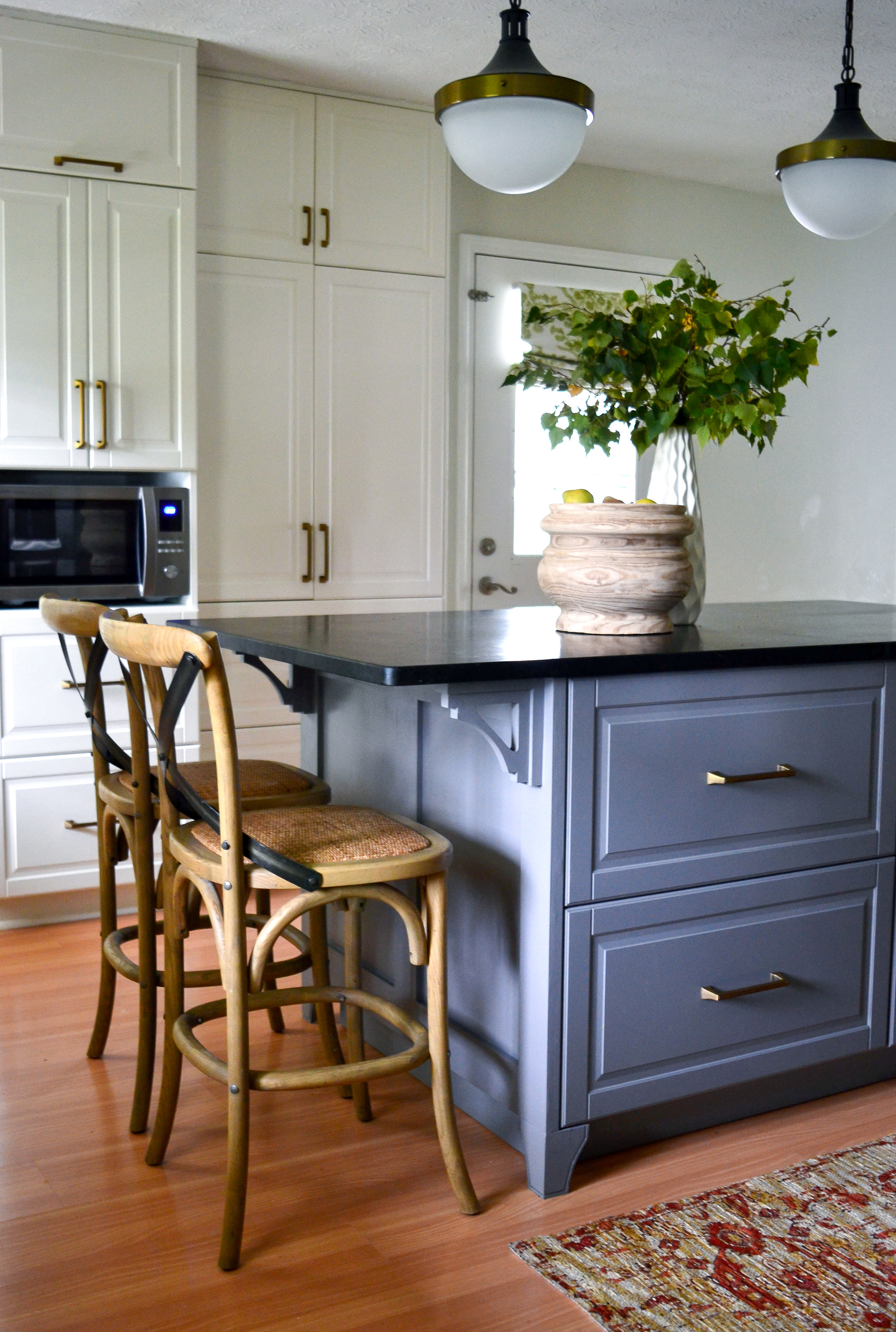
The kitchen before had so much floor space that you could literally dance across the room, but there was a lot of wasted space. When it came to cooking there was barely any prep area and not much storage.
Kitchen Before
Kitchen Before
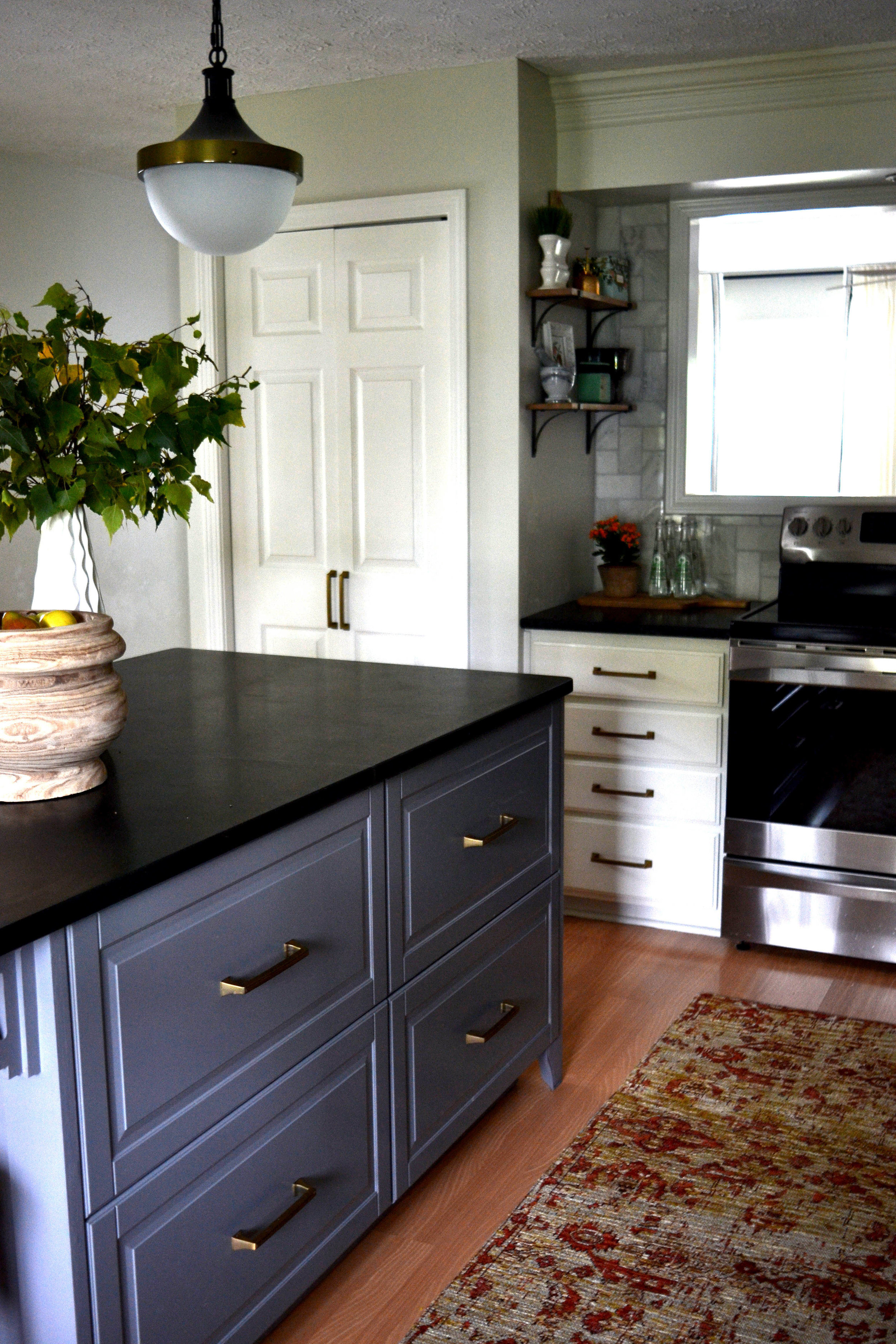
I designed an island that fit a couple bar stools in the center of the kitchen. I also had the wall of cabinets moved to the laundry area of the basement. In its place, I installed a wall of floor-to-ceiling cabinets. These cabinets now hold the microwave, toaster oven, hooks for coats, and drawers for shoes.
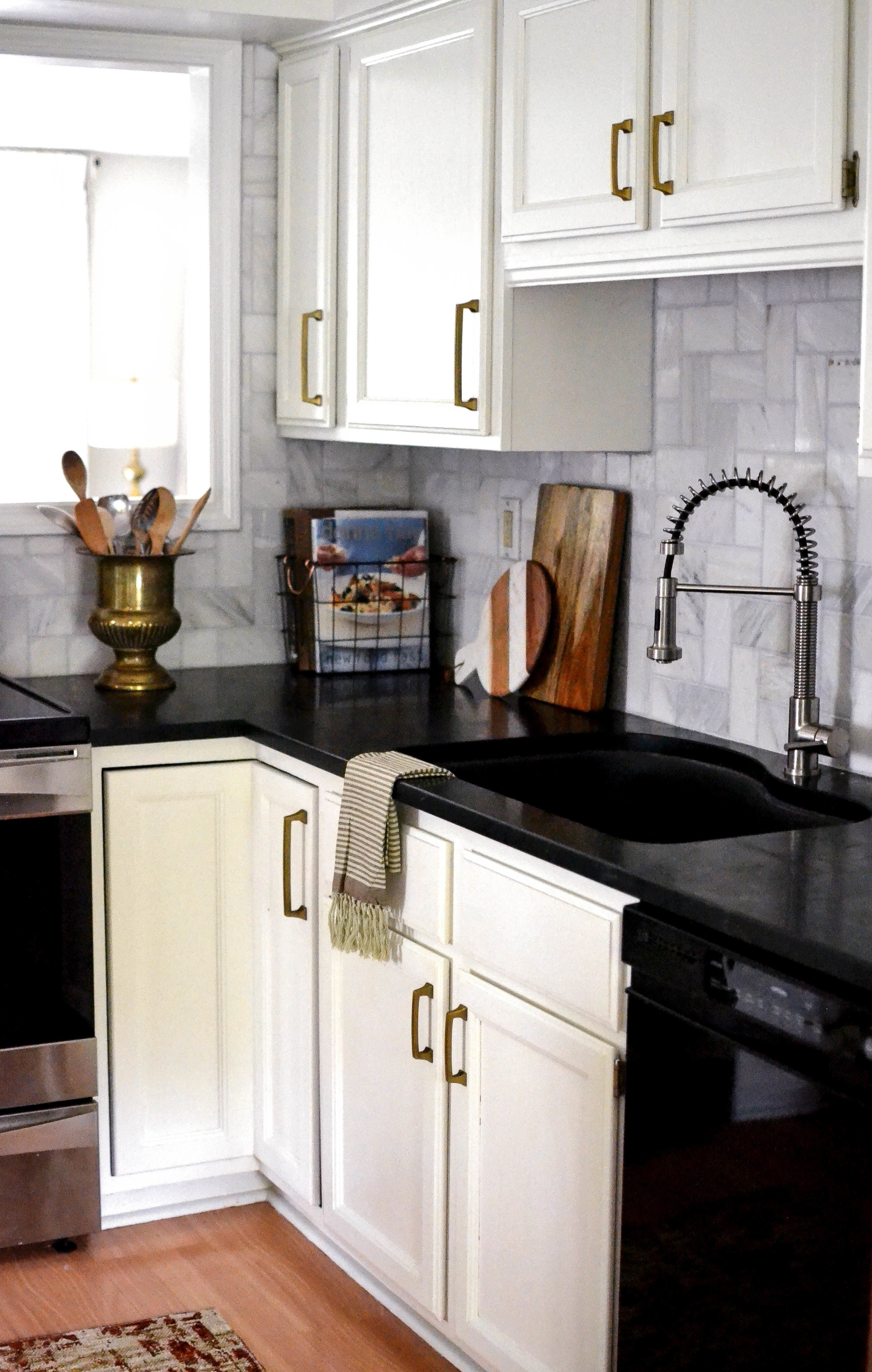
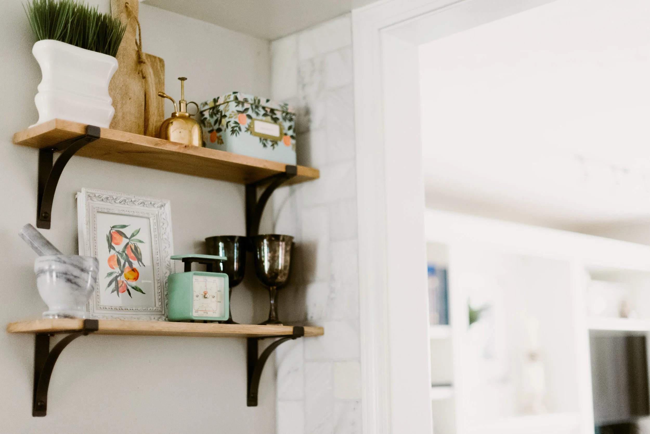
The laminate counter top was replaced with soapstone, and a marble back splash, in a fun pattern, replaced the 4 inch laminate ledge.
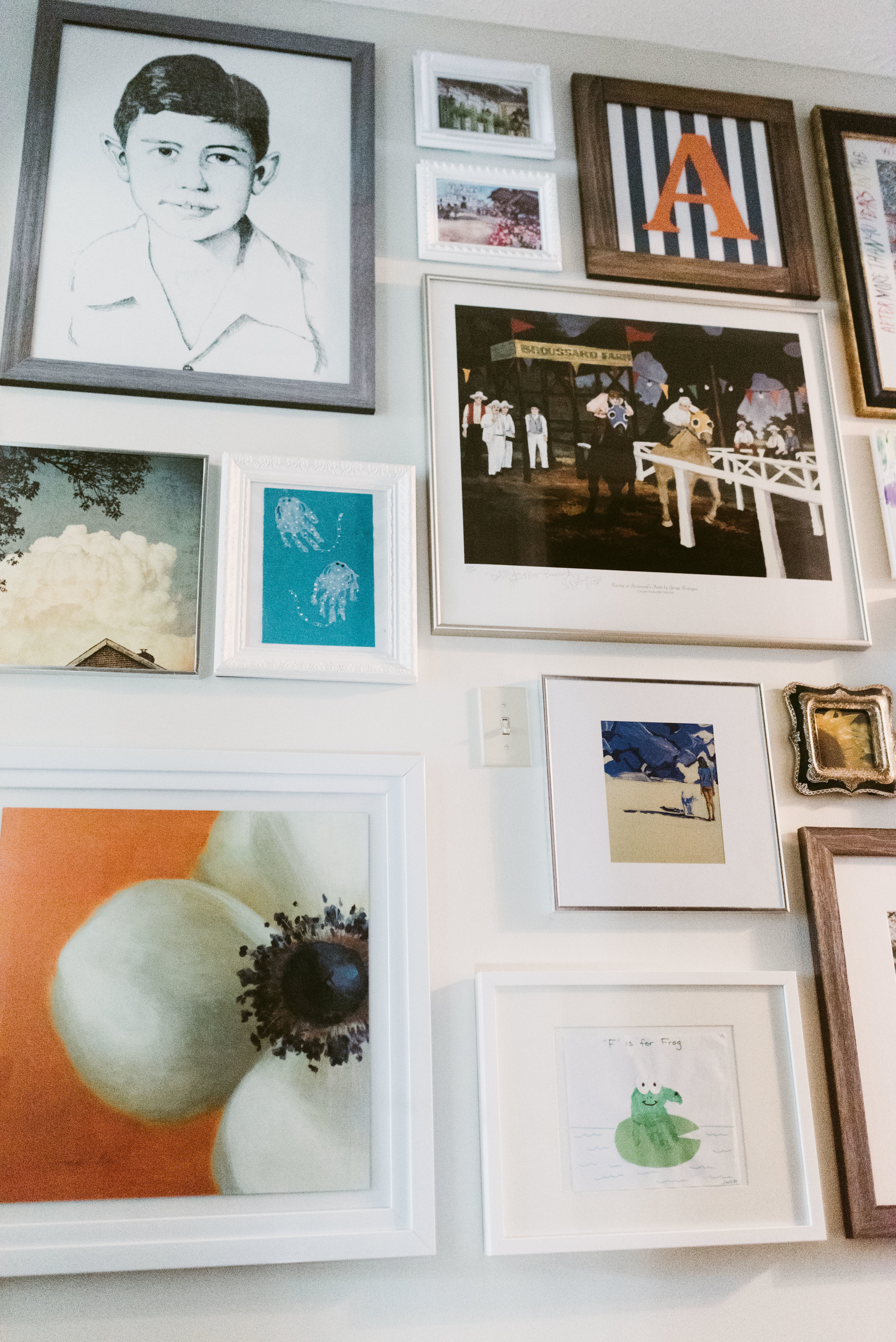
Closing out the tour for today, the hallway at the top of the staircase which can be seen from the front door. This hallway leads to the kid's rooms, so I decided to use the small area to display the family's collection of colorful art; including art done by the kids.
I hope you enjoyed part 1 of the tour. Part 2 will be posted in February, so stay tuned! For more inspiration follow me on pinterest and instagram!
Nikki
