Reel Styling Wednesday | Week 2
Here for another round.
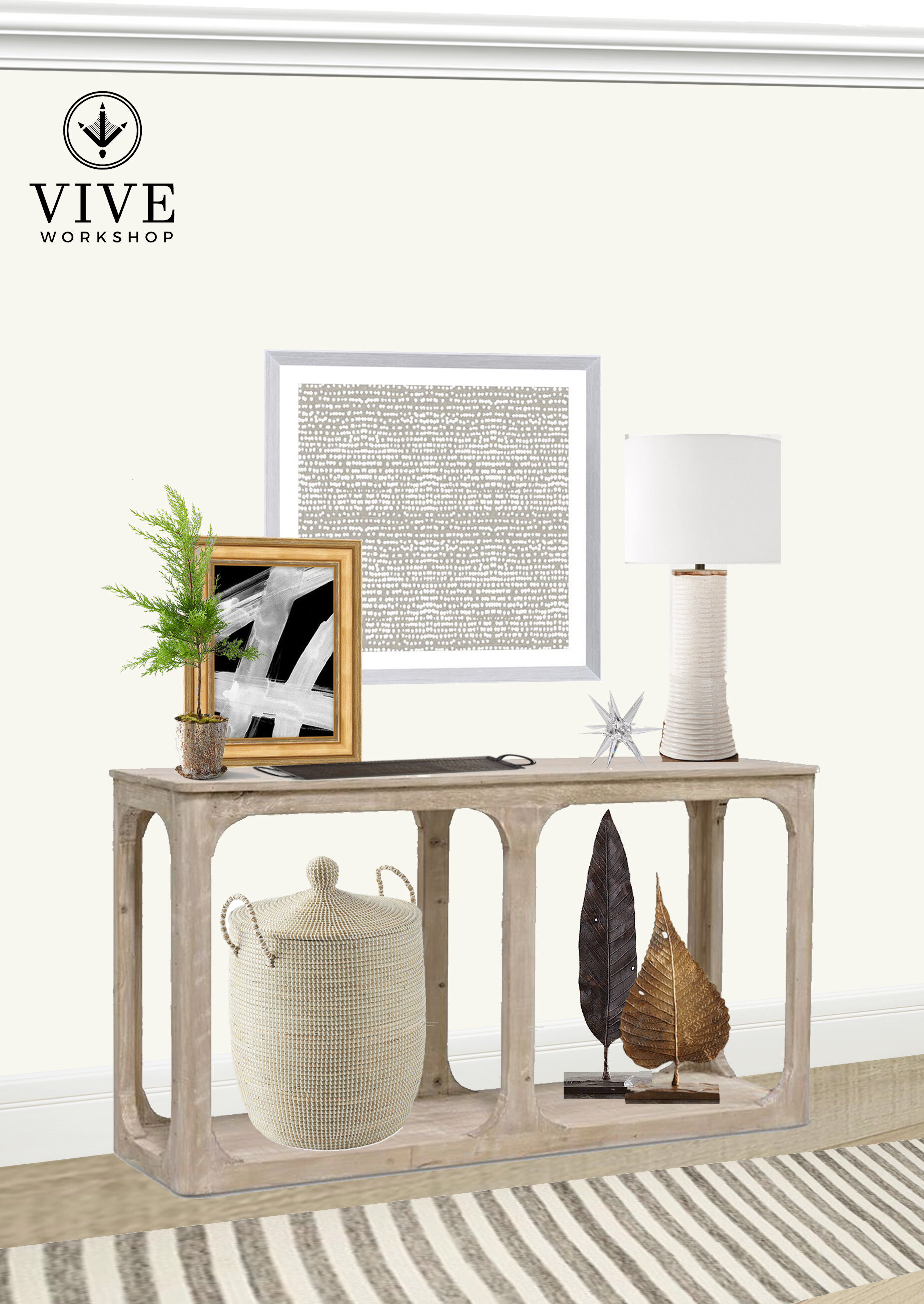
This week I played with asymmetry and layering of art; it is one of my favorite ways to add interest. This palette is another neutral one.
I started with centering the main art piece. I then placed the lamp to the right, making sure it varied in height from the art. Then, I layered another art piece in front of the hung piece. This art is another abstract piece, but is much more bold and has a different scale to the graphic. This was purposeful. I also mixed the metal frames.
From there, I accessorized the bottom with a textural basket and mixed-metal sculptures that fill the height of the lower shelf. Had I been doing a symmetrical look, I might have used two baskets.
I love adding greenery to soften this composition. This is always the time of year I am yearning for green, so a wispy lemon cypress felt like the perfect transition into spring.
Lastly, I added a tray for catching all the miscellaneous items we tend to set down when we walk into out house. Keeping it all corralled helps it to appear more organized.
Enjoy!
Nikki


